Infographics
Avian Airstrike: Aircraft-bird strikes across Australia (2008–2017)
People
Matt Malishev
Tasks
- Create a 2D density distribution heatmap with satellite data as a basemap over a conventional vector basemap
- Build an infographic exploring the Australian aviation wildlife strike statistics dataset from the Australian Transport Safety Bureau
View hi-res infographic
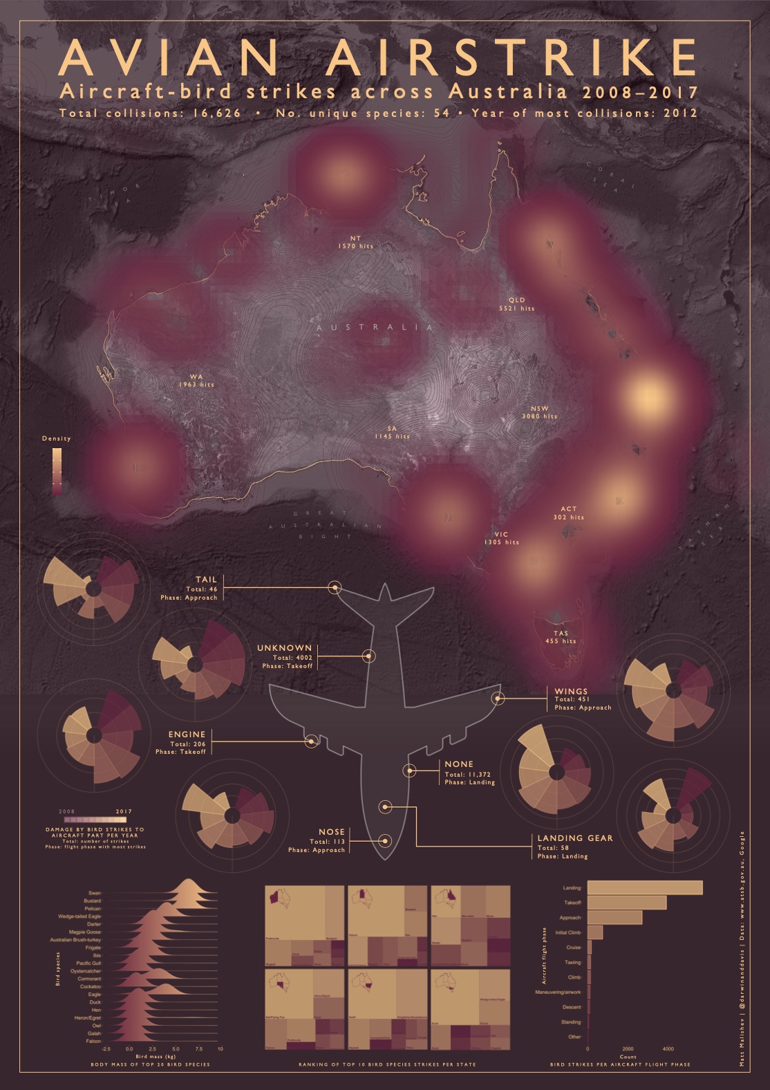
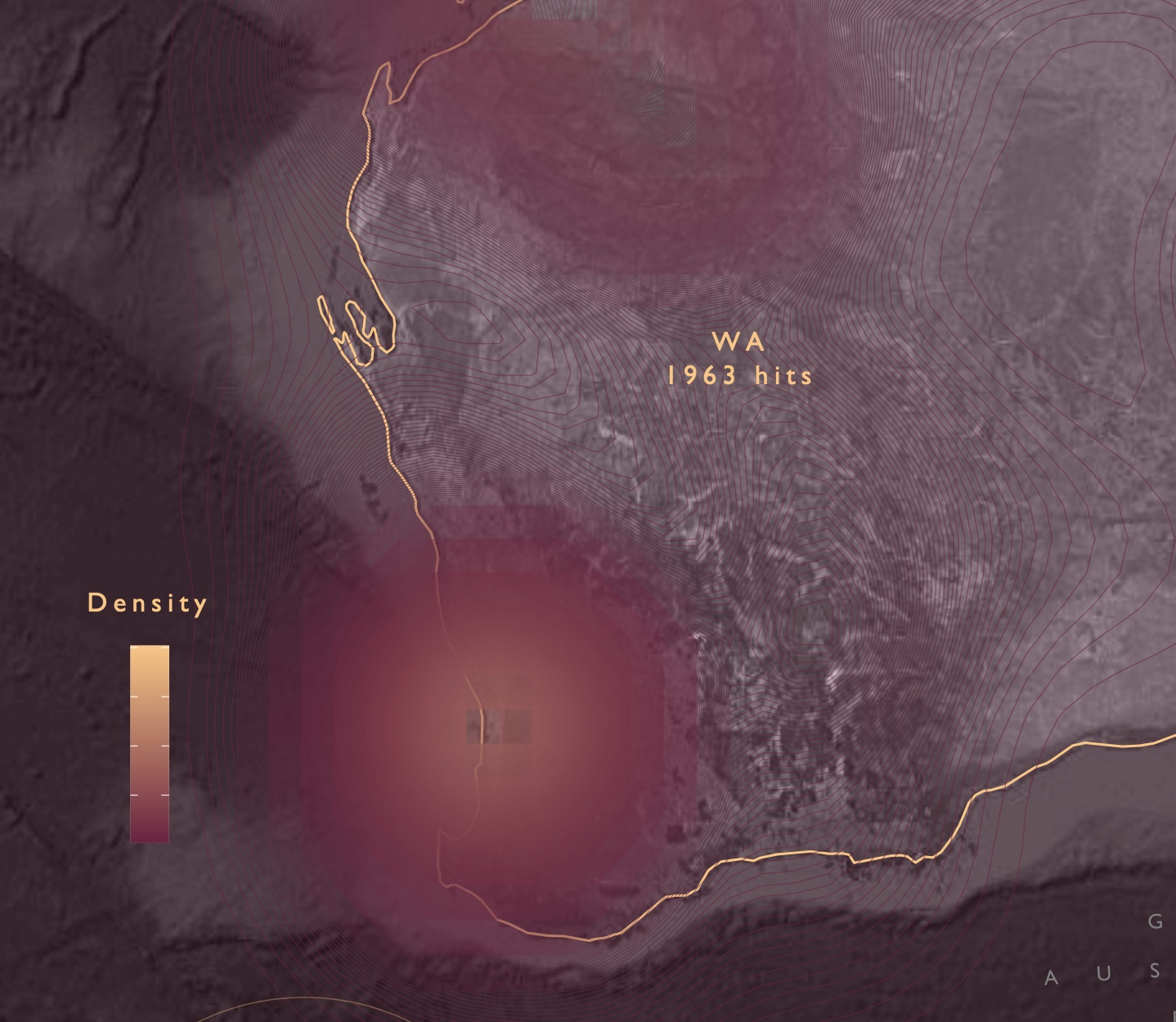
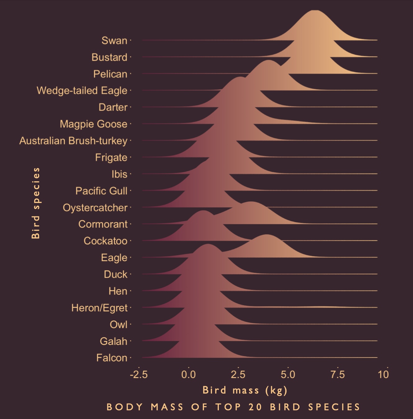
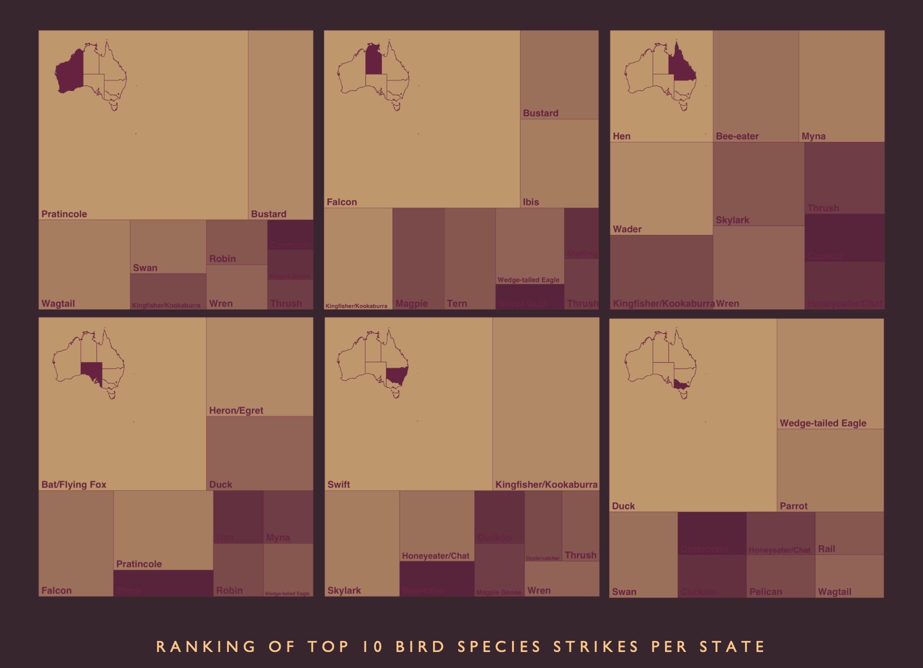
Apparently a lot of birds and flying creatures collide with a lot of aircraft around Australia. And there are data covering it all, down to the lat/lon location, aircraft type and purpose, and extent and aircraft segment damage, to name a few variables.
I originally built an interactive map integrating R and Mapbox Studio to view these data covering aircraft and bird strikes across Australia from 2008 to 2017. Lots of nice data and variables to explore from the aircraft (AircraftDamageLevel, AircraftType, PhaseOfFlight, Part damaged) and avian angle (SpeciesFamily, bird_size, bird_mass).
Given the data depth, I gave the dataset another run to dive further and this time create an infographic showcasing these neat variables and presenting the interesting patterns in one snapshot, which is why I like making infographics.
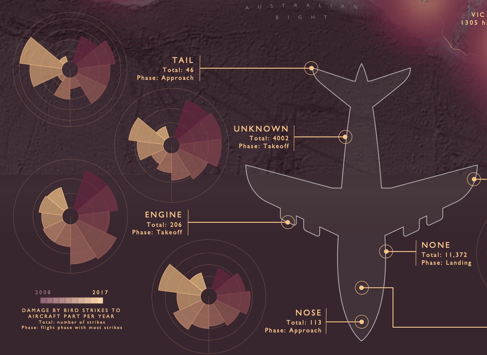
On the tech side, I wanted to build a heatmap of lat/lon aircraft-bird strikes across Australia using hi-res satellite data as a basemap rather than a conventional vector map, which has been done to death. I sourced the satellite data from Google queries and ended up adding a colour overlay with a low transparency to a grayscale satellite basemap that matched the lower colour variable used for the colour palette in the plots you see throughout the infographic. This gave a subtle colour wash to the basemap that looked more intense than the standard grayscale and the data were dense enough to contrast nicely against this basemap.
Below is the original interactive map using R and Mapbox.

Click for full map
(Best viewed full screen; switch browsers if loading time is slow)
Tools
R
Mapbox
HTML
CSS
Links
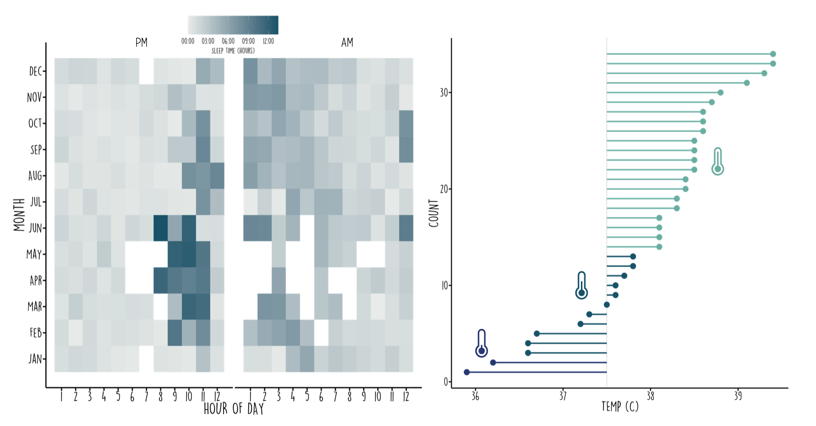
My First Year: Exploring daily life of a 1-year-old using Babytracker app activity data (client project)
People
Matt Malishev
Tasks
- Build a printable infographic from client mobile app data
- Analyse and wrangle data to test different data viz and plot ideas
- Build code templates to easily integrate future data from app (potential for API)
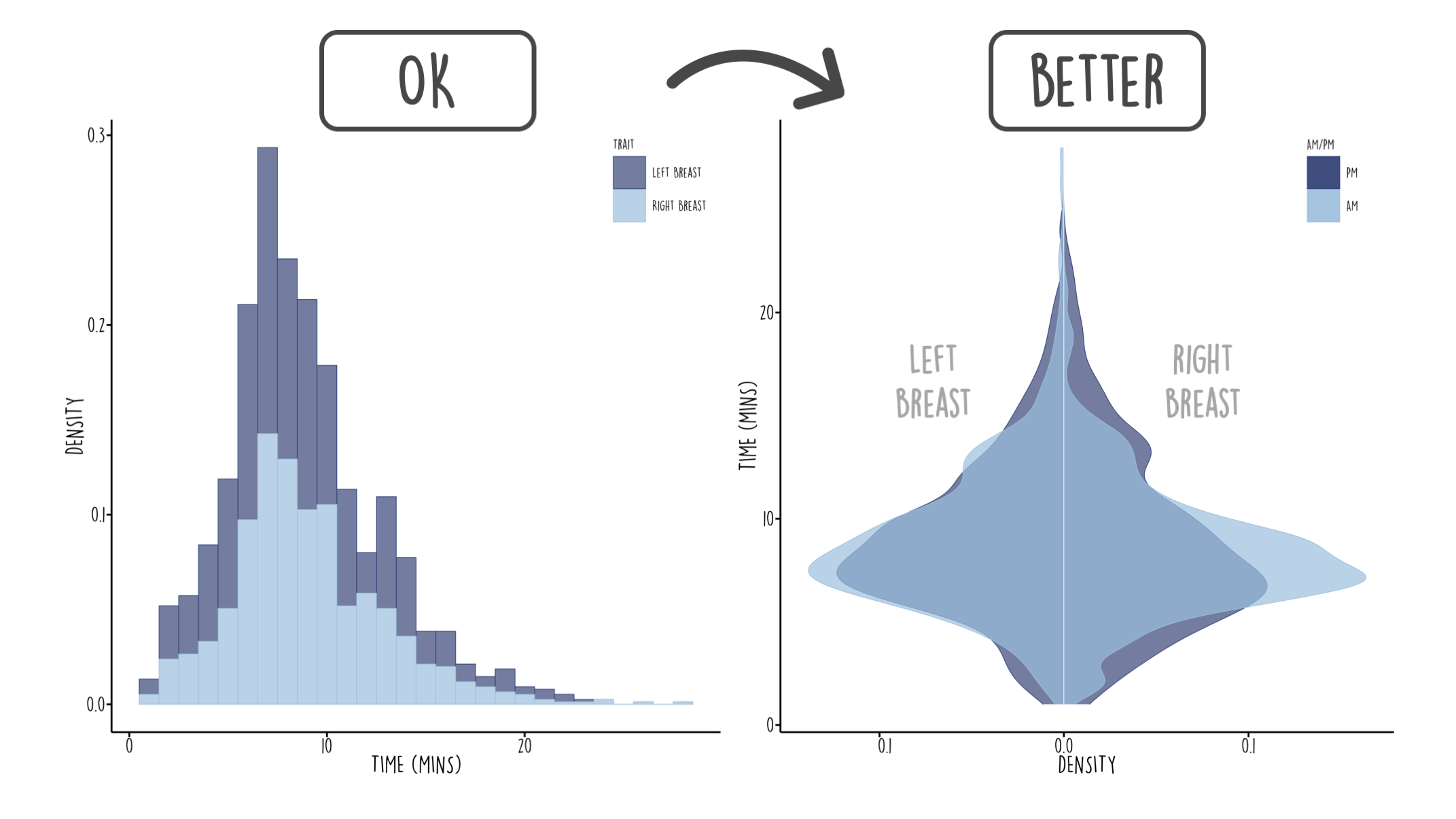
Daily life for the first year of a 1-year-old using client data from the Babytracker app. Data covers activity time, sleeping, feeding and meal type, breast/bottle feeding, bath/play time, pee/poo activity, body temperature and medicine intake measurements, and growth over time. Client info within infographic is masked.
View hi-res infographic
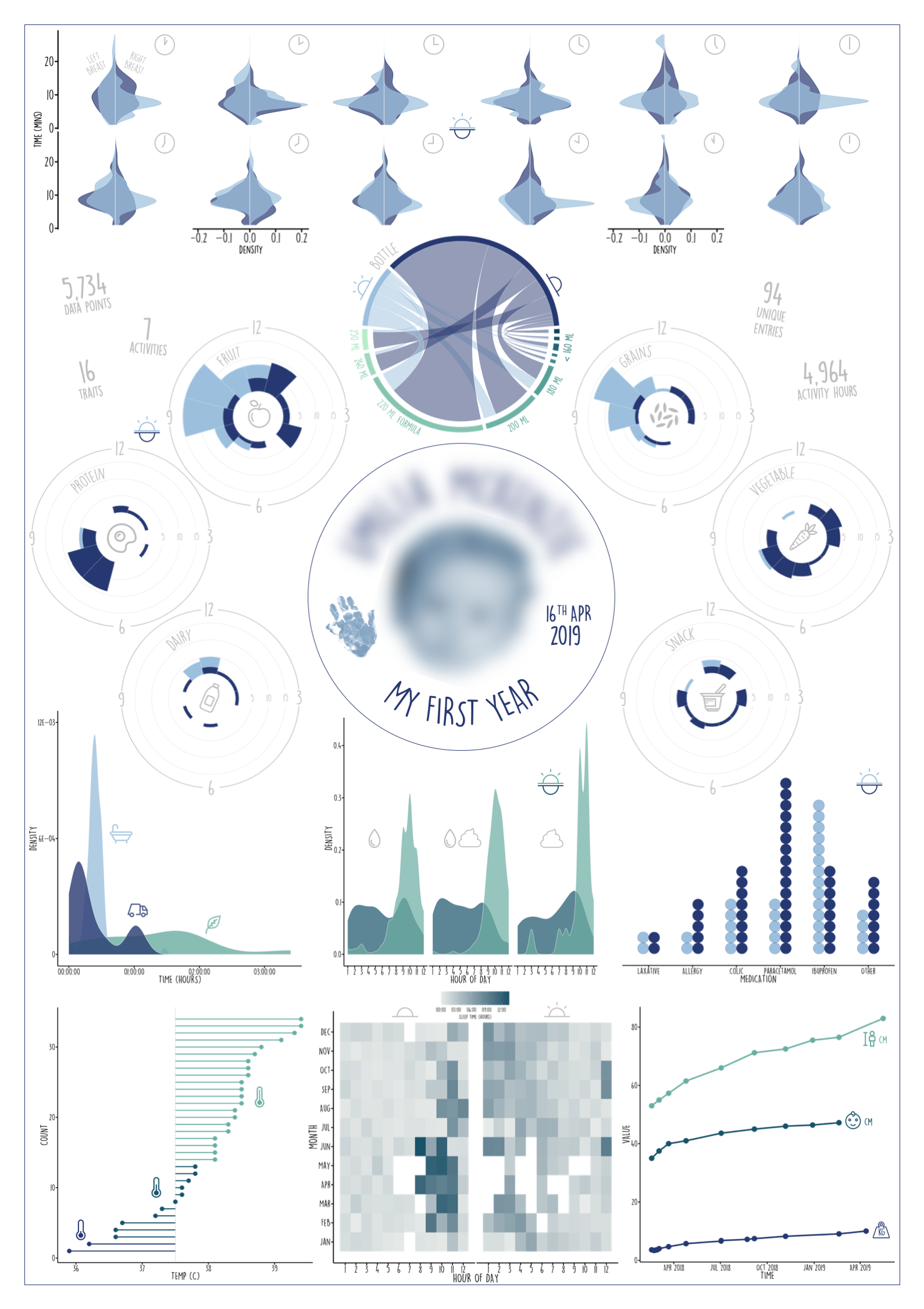
Snapshot analysis and decision making on data viz outputs when confronted with different types of data.

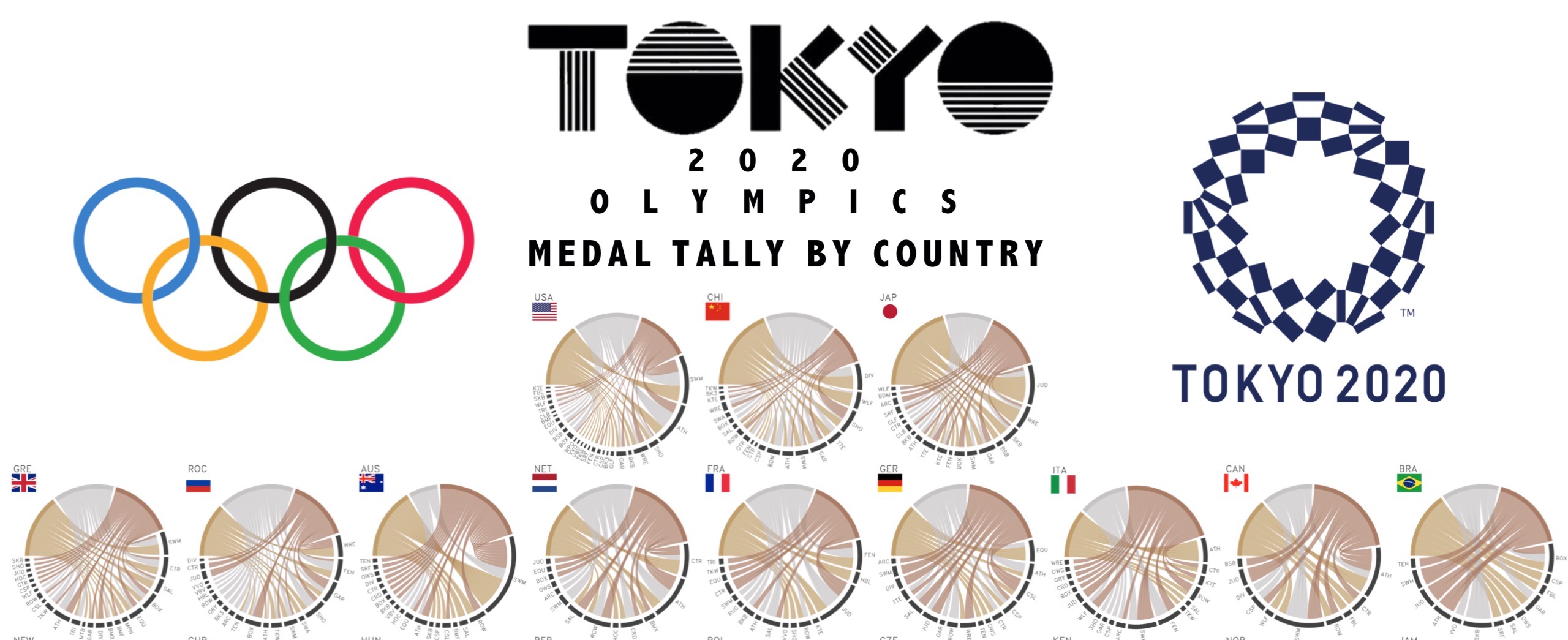
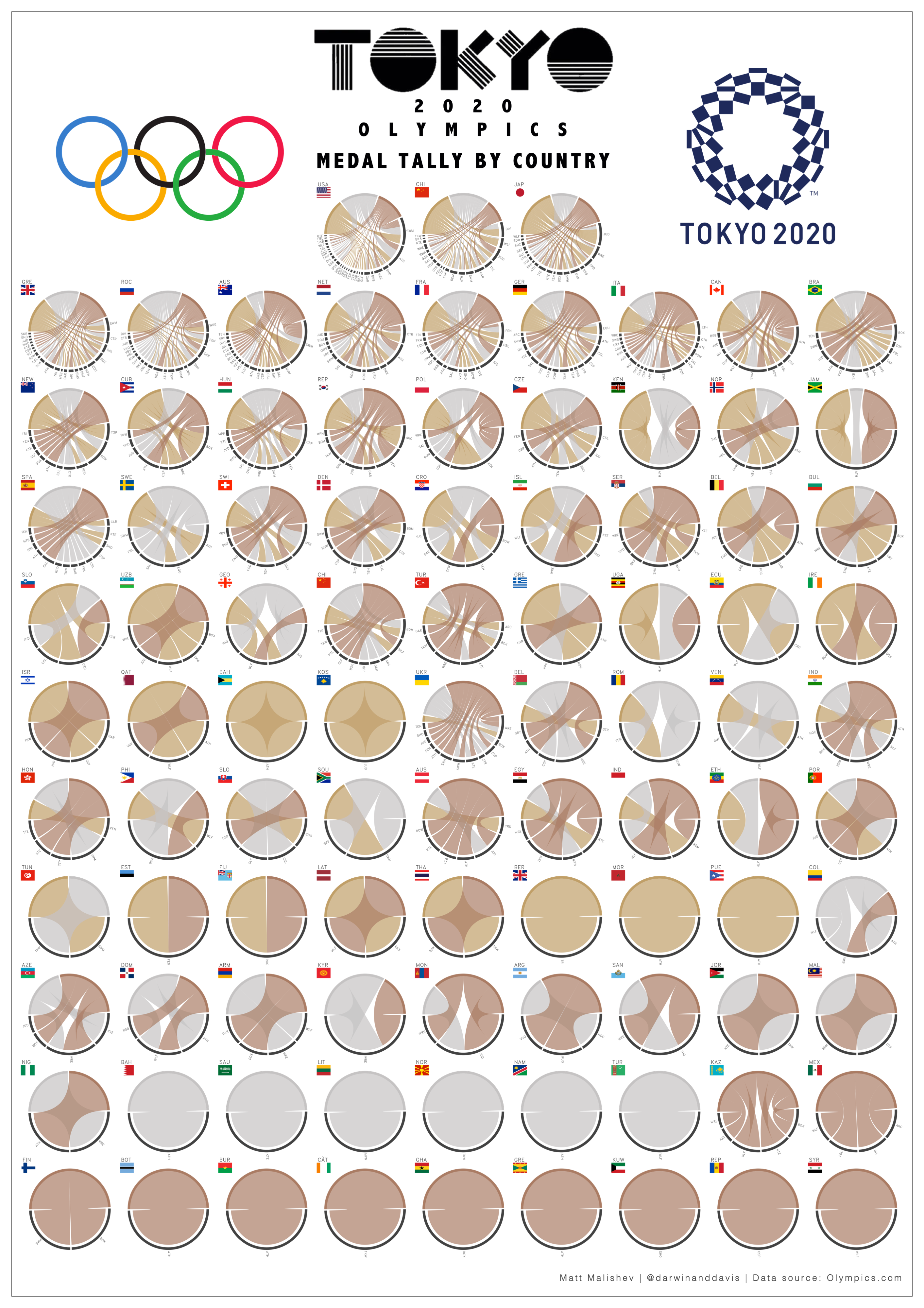
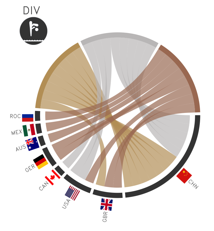
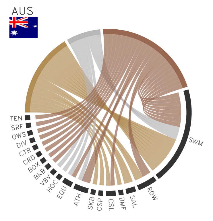
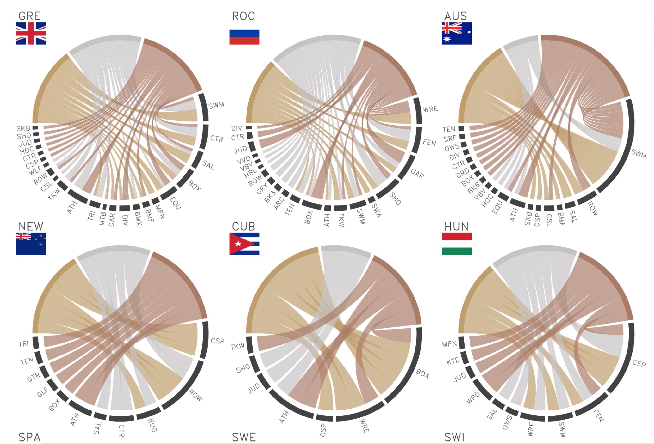
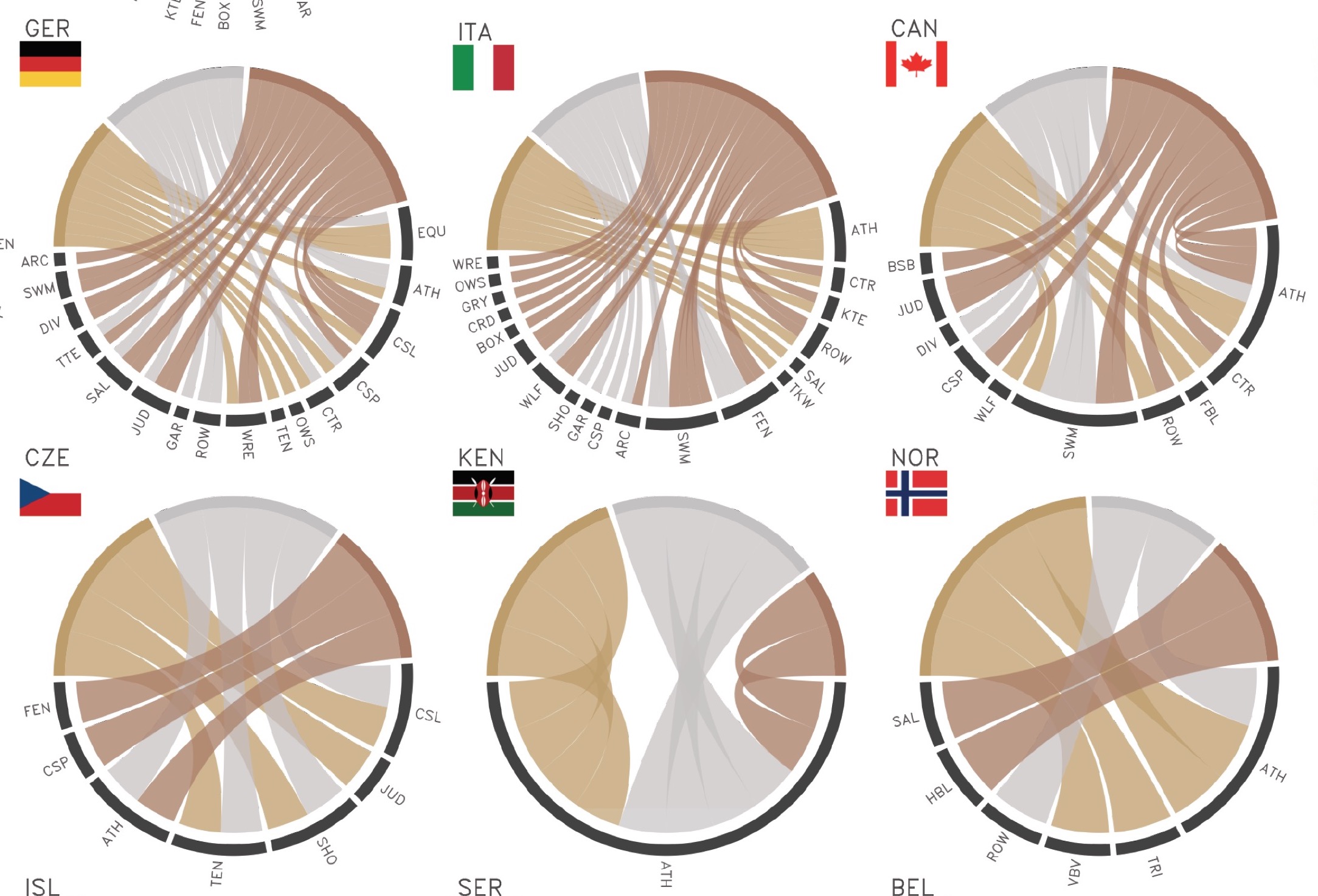
Dissecting Tokyo 2020 Olympics medal tally data by country and medal count per event
People
Matt Malishev
Tasks
- Webscrape live medal tally data from the Tokyo 2020 Olympics site
- Wrangle and analyse the data to create digestible datasets and generate data viz
- Build an infographic using the data/plots
This project uses webscraping, data analysis/viz, and plotting tools in R to access, wrangle, analyse, and plot Tokyo Olympics 2020 medal tally data to generate the graphics used in the below infographic.
Step-by-step instructions and code are detailed in the below link. All code, compiled datasets, and source files are also available on Github.
Outcomes
Tokyo 2020 Olympics medal tally infographic
Writeup and analysis
View hi-res infographic
Tools
R
HTML
CSS
JS
pacman::p_load(here,rvest,xml2,dplyr,circlize,tidyr,stringr,purrr,magick,reshape2)
Links
Data
Tokyo 2020 Olympics official website
Header Infographic of medal tally analysis for Tokyo 2020 Olympics. Data: Tokyo 2020 Olympics official website
| Back to top | Home page |