30 Day Map Challenge
The #30DayMapChallenge: A daily mapping/cartography/data visualization challenge aimed at the spatial, mapping, and cartography community. Here were my self-inflicted challenges this year.
- Learn something new for every project—new data, new mapping element, new map projection, etc
- Make data-driven maps when possible (time permitting)
- Use diverse data sources and types and choose widely, i.e. search data, wrangle data, map data
- Do at least half (15 days)

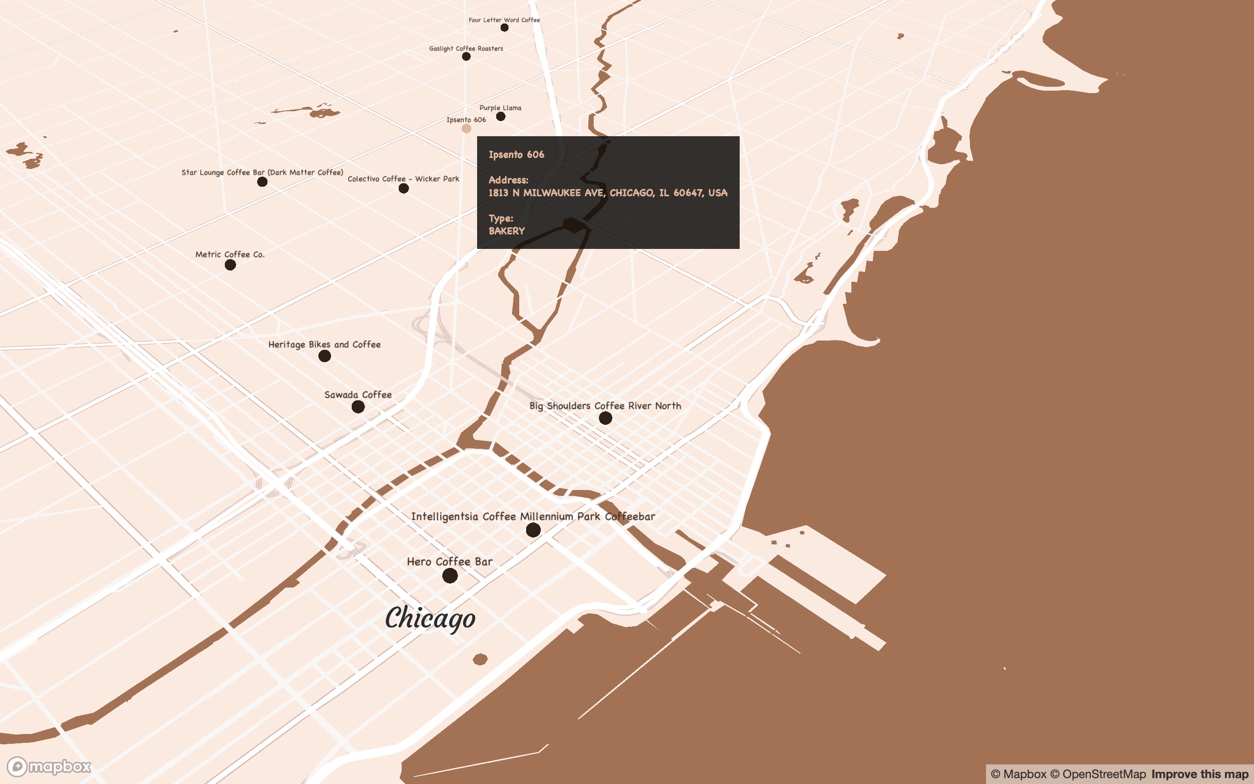
Day 1: Points
Mapping my favourite coffee places around the world
An interactive map of my favourite coffee spots around the world (so far) using Mapbox and mapdeck in R.
Part of a larger project where I’m mapping my favourite food places around the world to create a centralised repository so I can more easily address the following conversation:
Friend: ‘Do you know any good INSERT FOOD places in INSERT CITY?’
Me: ‘Sure thing, I collated all my favourite places and put it all in this site. Enjoy.’
Not an exhaustive list of places and updated regularly as I find them. The total list of places for the overall project is close to 100 spanning different categories and the code is automated to pull the data with new updates.
Process
- Data were georeferenced from mobile location data using Open Street Map
- Map designed in Mapbox Studio
Click for full map
(Best viewed full screen; switch browsers if loading time is slow)
Tools
R
Mapbox
pacman::p_load(here,sf,RColorBrewer,dplyr,ggmap,sp,maptools,scales,rgdal,ggplot2,jsonlite,readr,devtools,colorspace,mapdata,ggsn,mapview,mapproj,ggthemes,reshape2,grid,rnaturalearth,rnaturalearthdata,ggtext,purrr)
Links
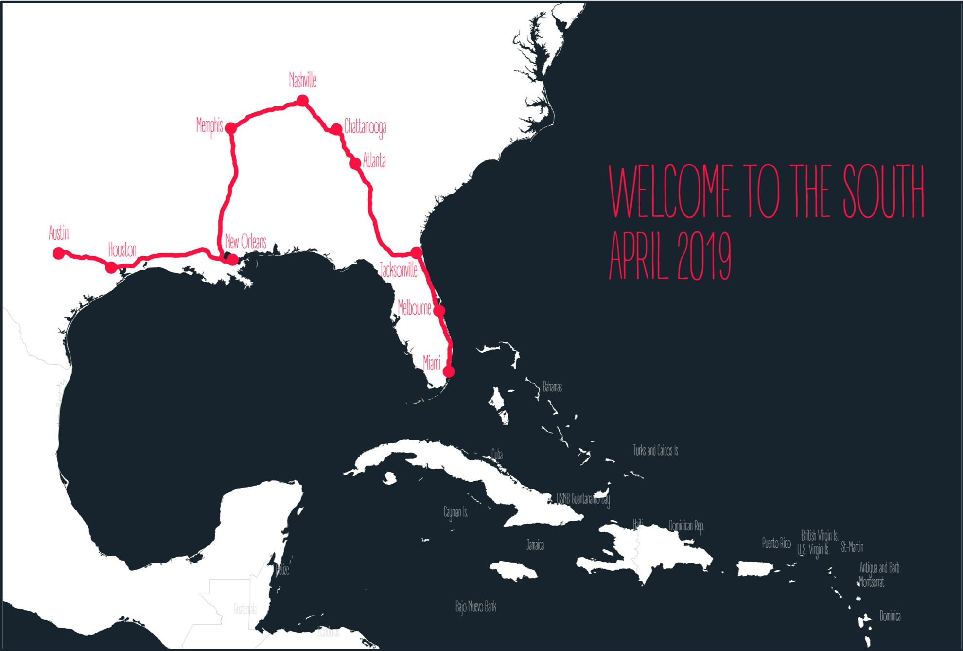
Day 2: Lines
Roadtrippin’ the US
My parents visited the US/me when I was living in ATL. They roadtripped the south, starting in Austin. I met them in Memphis, then drove to ATL. This map is using geolocation data to track their pathway across the US with R and Mapbox.
Data were georeferenced from mobile location data using Open Street Map. Pathways were mapped from KML data. Polygon data were retrieved from Natural Earth Map data.
Tools
R
pacman::p_load(here,sf,RColorBrewer,dplyr,ggmap,sp,maptools,scales,rgdal,ggplot2,jsonlite,readr,devtools,colorspace,mapdata,ggsn,mapview,mapproj,ggthemes,reshape2,grid,rnaturalearth,rnaturalearthdata,ggtext,purrr)
Day 4: Hexagons
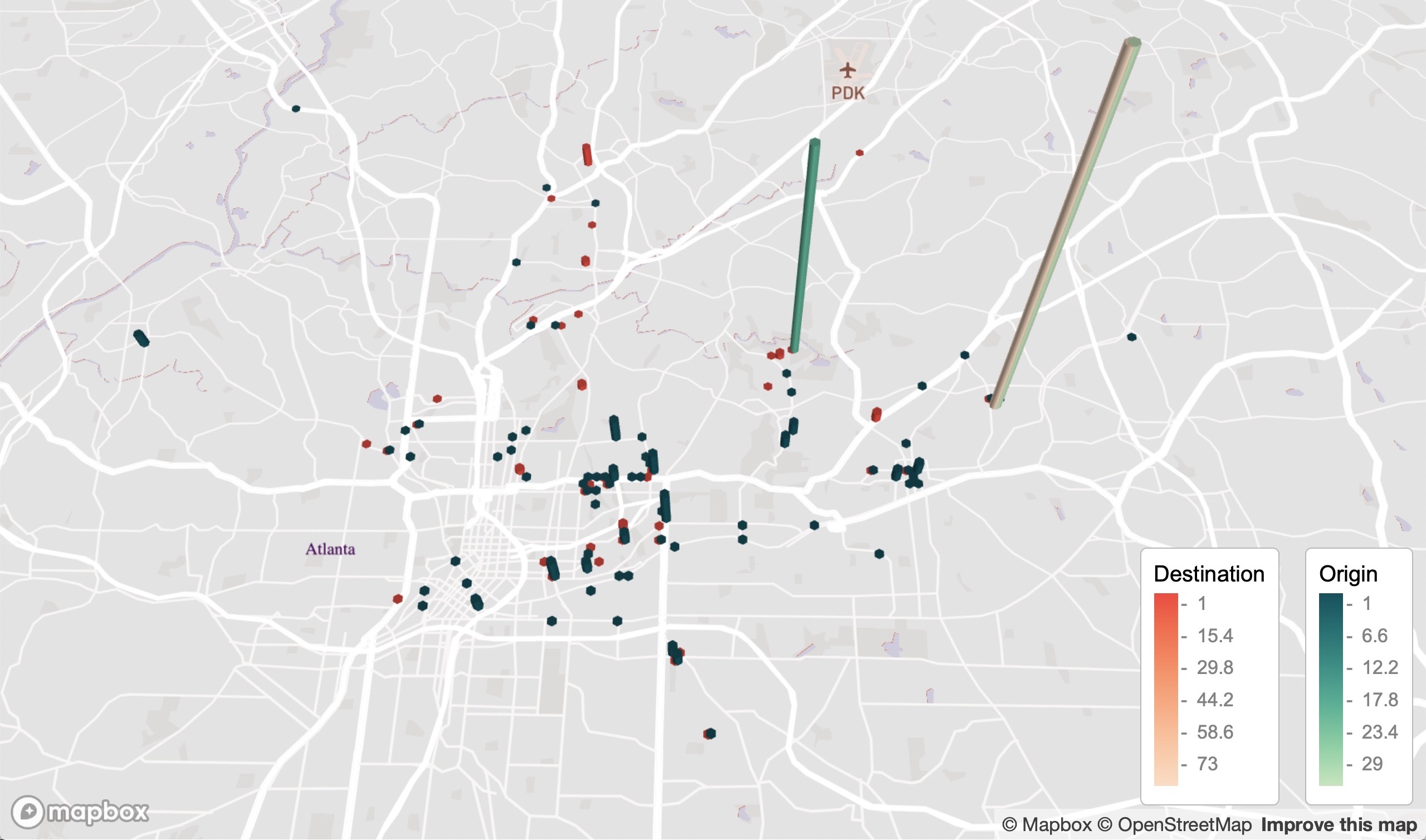
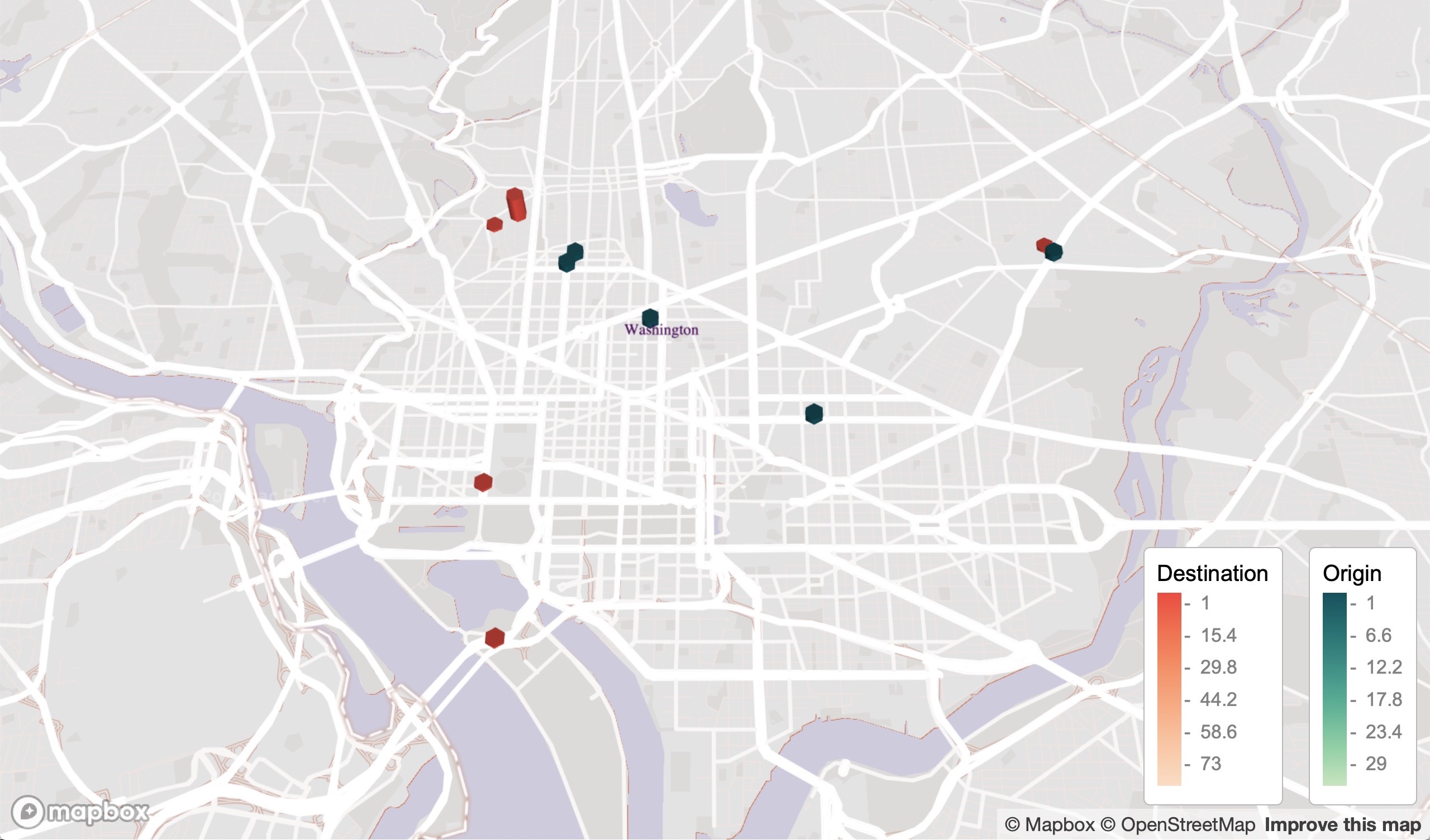
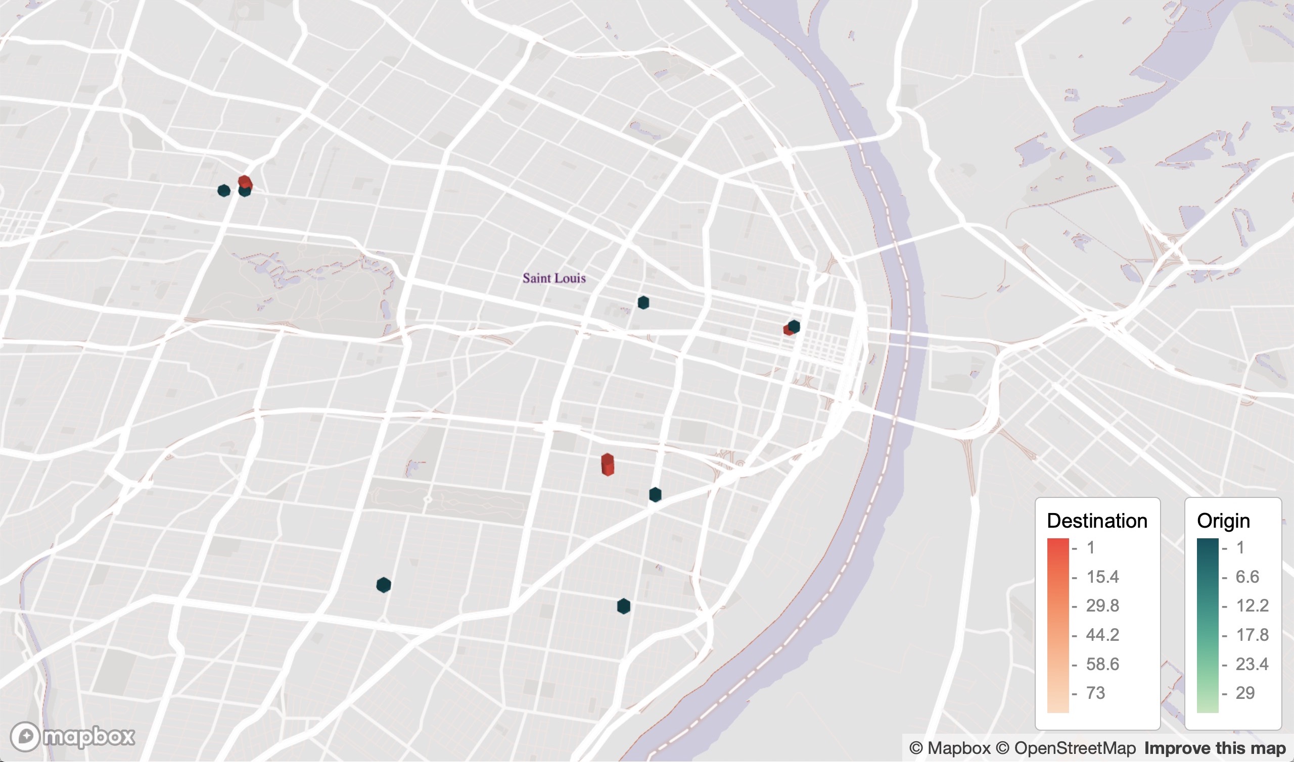
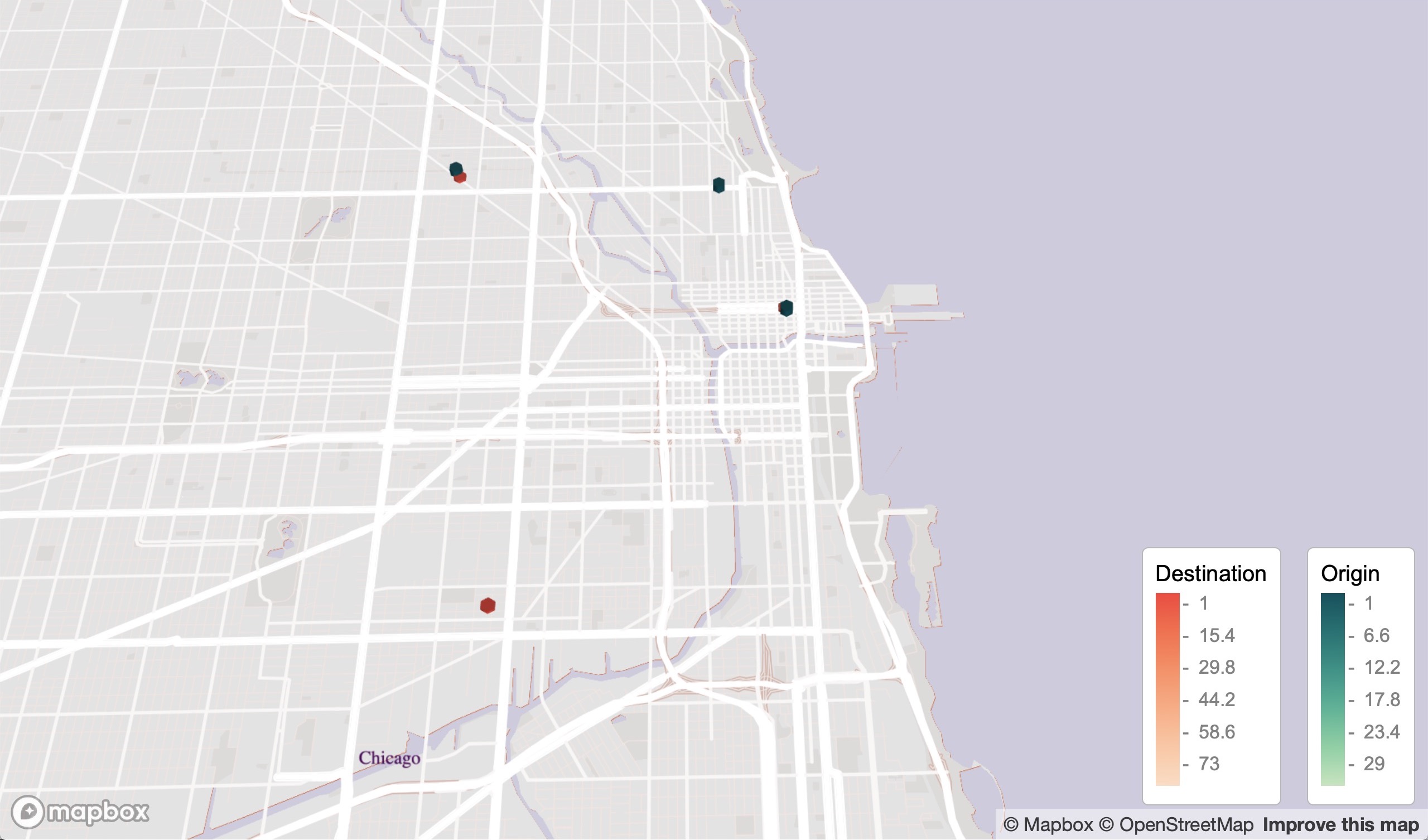
Mapping my Lyft ride activity over two years
Using geolocation data for my Lyft rides as a passenger to build an interactive map that shows my Lyft activity, including origin pickup and destination dropoff points. The data covers the USA.
These data are really cool, so I just wanted to make use of them. Hexagons are good for visualising frequency and mobility spatial data. My data here ended up being too coarse (obviously I didn’t take enough Lyft rides) to leverage this, but it tells a story about where my ride activity is weighted. There is also a time component, which I’ll definitely use for another analysis.
Notes
- Data were obtained from my Lyft ride report.
- Data were first georeferenced to get latlons.
- Zoom out to see the cities where I used Lyft to get around. Cities with labels contain data, sometimes only a few points.
- Note the legend in the below images in case the legend in the link is chopped off.
Limitations
- Hexagons are good for large scale coarse and clustered data, like heatmaps. The data here are too sparse to make full use of this.
- There is a higher density of destination sites because I primarily used Lyft to get home, which is concentrated on one latlon point.
- Georeferencing the data didn’t find all locations, so some points are missing.
Click for full map
(Best viewed full screen; switch browsers if loading time is slow)
Atlanta, USA (where I lived during this time)
Washington DC, USA
St Louis, USA
Chicago, USA
Tools
R
Mapbox
pacman::p_load(mapdeck,readr,ggmap,dplyr,sf,sfheaders,data.table,tigris,sp,maps,colorspace)
Links
Day 6: Red
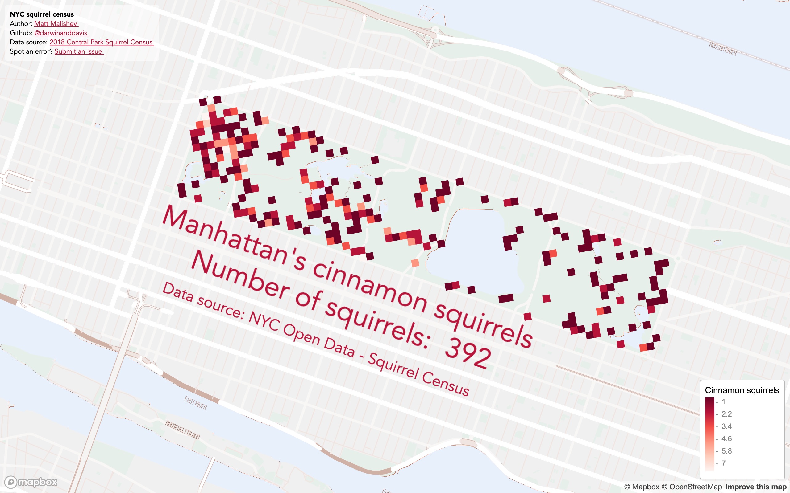
Cinnamon squirrel locations in NYC Central Park
Squirrels! The NYC Open Data Squirrel Census on squirrel sightings. I’ve seen these data used many times and I hadn’t tried them yet. There are detailed behaviour data too, but location data are fine for this exercise.
The fur colour is defined as cinnamon. I’m no squirrel expert, but I’ve seen these squirrels in person/in squirrel and they look pretty red to me. There are probably species differences between the cinnamon and red varieties. I don’t even like cinnamon.
Press the down arrow or use the up/down webpage scroll bar if the legend is chopped off.
Click for full map
(Best viewed full screen; switch browsers if loading time is slow)
Tools
R
Mapbox
pacman::p_load(here,mapdeck,dplyr,purrr,readr)
Links
R code
OpenData NYC squirrel census
Day 8: Yellow
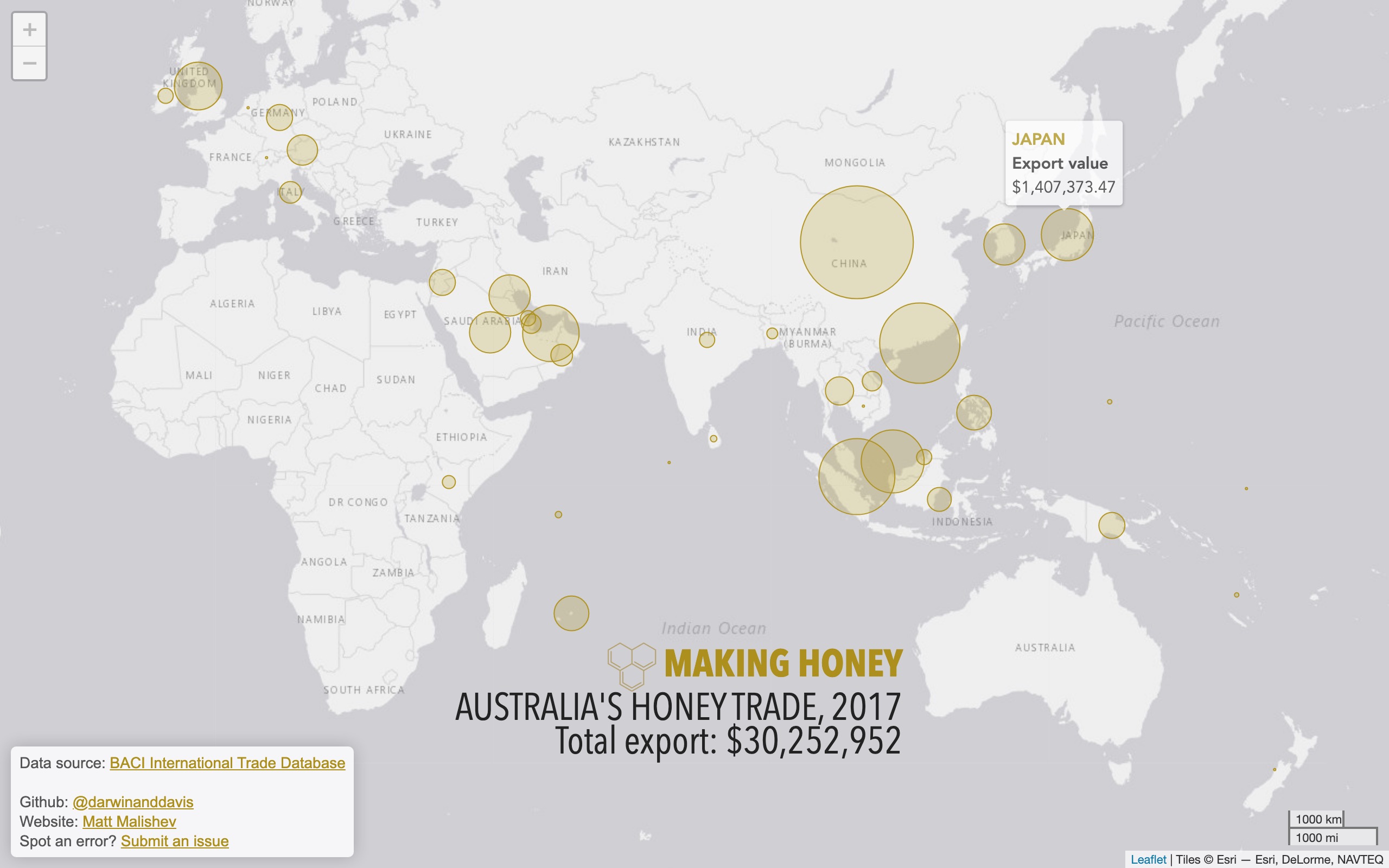
Australia’s global honey export trade
Mapping Australia’s honey exports from some publicly available trade data for 2017. Australia is in the top five major exporters for honey.
The data go as far back as the 1960s. However, a time series component seemed like overkill for this particular exercise.
Click for full map
Tools
R
Leaflet
pacman::p_load(here,dplyr,rworldmap,leaflet,readr,rgeos,purrr,stringr,ggthemes,showtext,geosphere,htmlwidgets)
Links
R code
BACI International Trade Database
Day 9: Monochrome
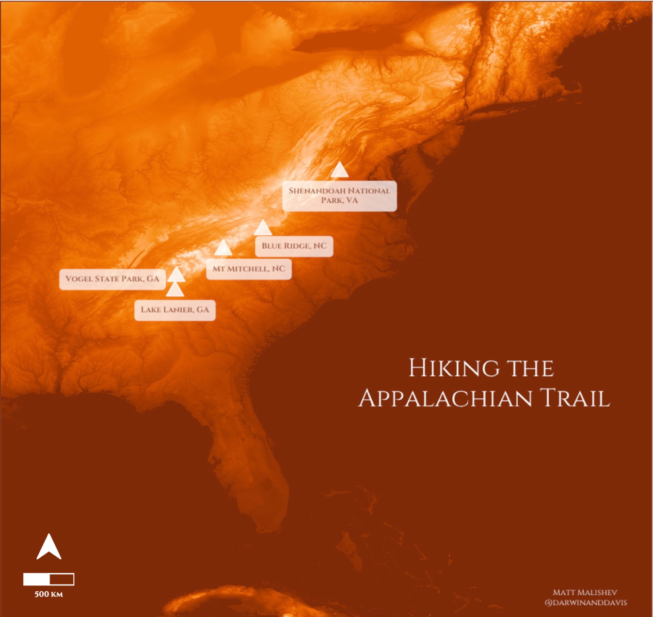
Exploring the Appalachian Trail
Exploring digital elevation models (DEM) of the Appalachian Trail, USA, with the parts along the range where I’ve visited for either camping or hiking during 2018–2020.
This was more of a sandbox session in colour palettes and rasters to bring out some of the super intricate detail of terrain models, as well as improving my text and label positioning in R. Thanks, ggtext.
Tools
R
pacman::p_load(dplyr,readr,rvest,xml2,magrittr,ggplot2,stringr,ggthemes,ggnetwork,elevatr,raster,colorspace,ggtext,ggsn,ggspatial)
Links
Data
Terrain raster 3DEP data courtesy of the U.S. Geological Survey
Terrain tiles obtained from Amazon Web Services
Day 10: Grid
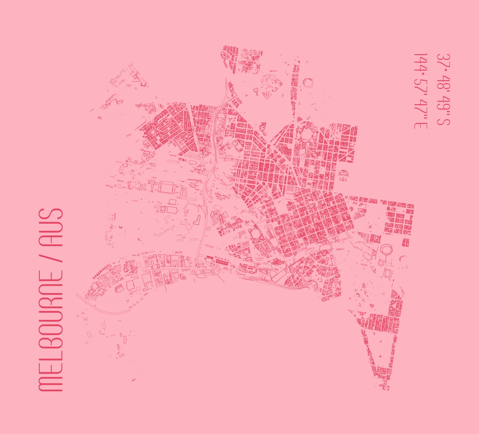
Melbourne’s city footprint
A minimal map design showcasing the classic grid structure of my home city, Melbourne, Australia. There are tonnes of detailed data on the City of Melbourne Open Data portal that I may dive into for some future analyses.
For this challenge, I wanted to make a minimal sketch design map that plays on angles and grid structure. Also, test my label positioning skills using ggtext.
Tools
R
pacman::p_load(dplyr,readr,rvest,xml2,magrittr,ggplot2,stringr,ggthemes,ggnetwork,elevatr,raster,colorspace,ggtext,ggsn,ggspatial)
Links
Data
Day 11: 3D
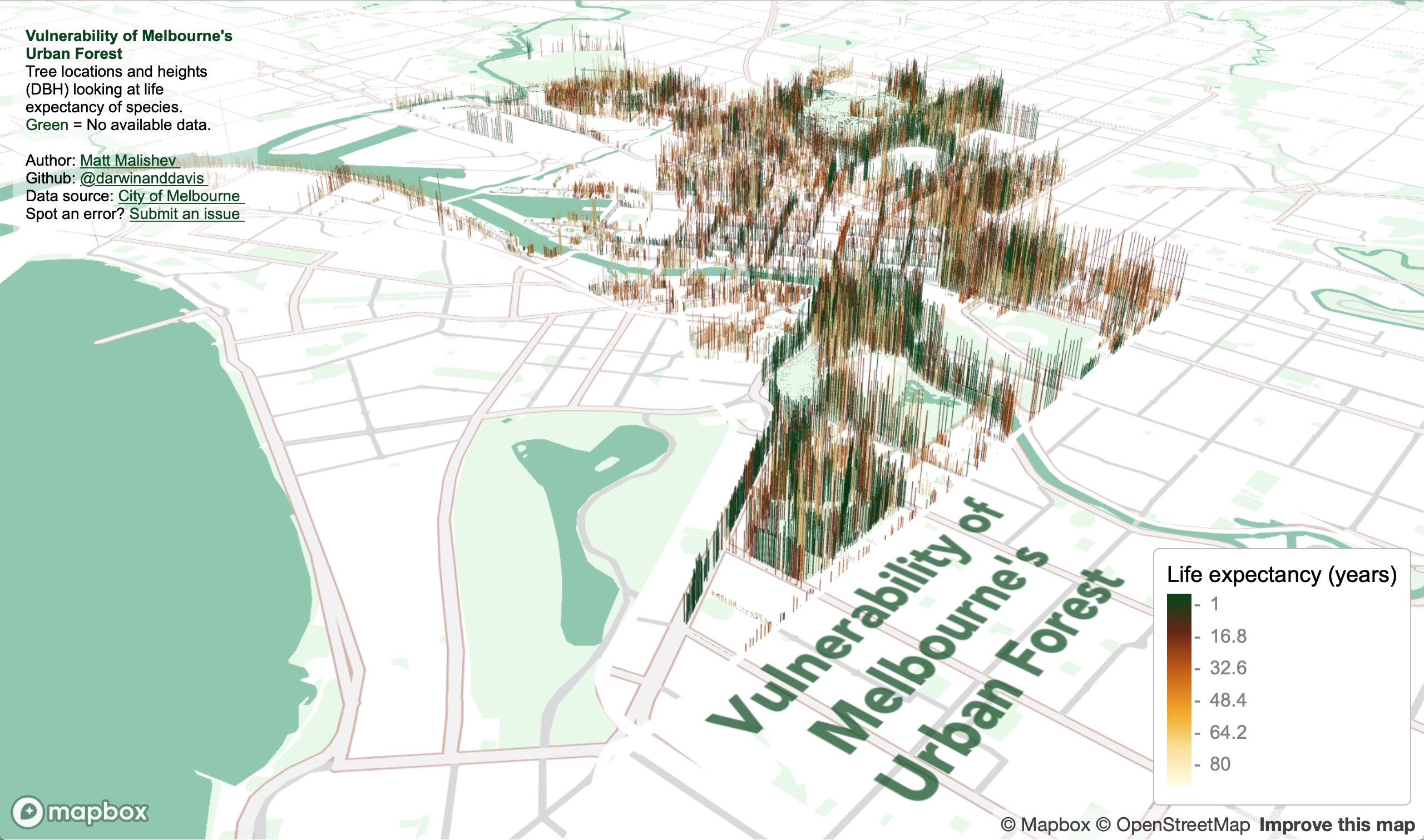
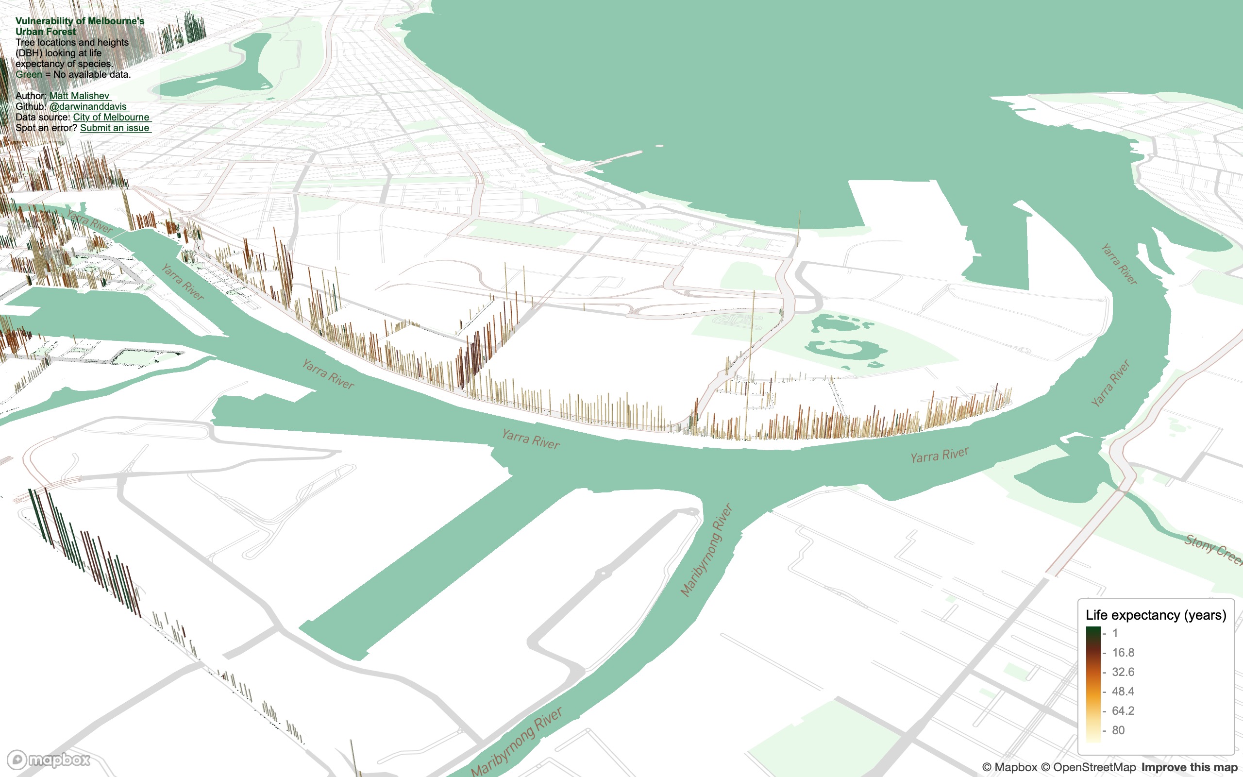
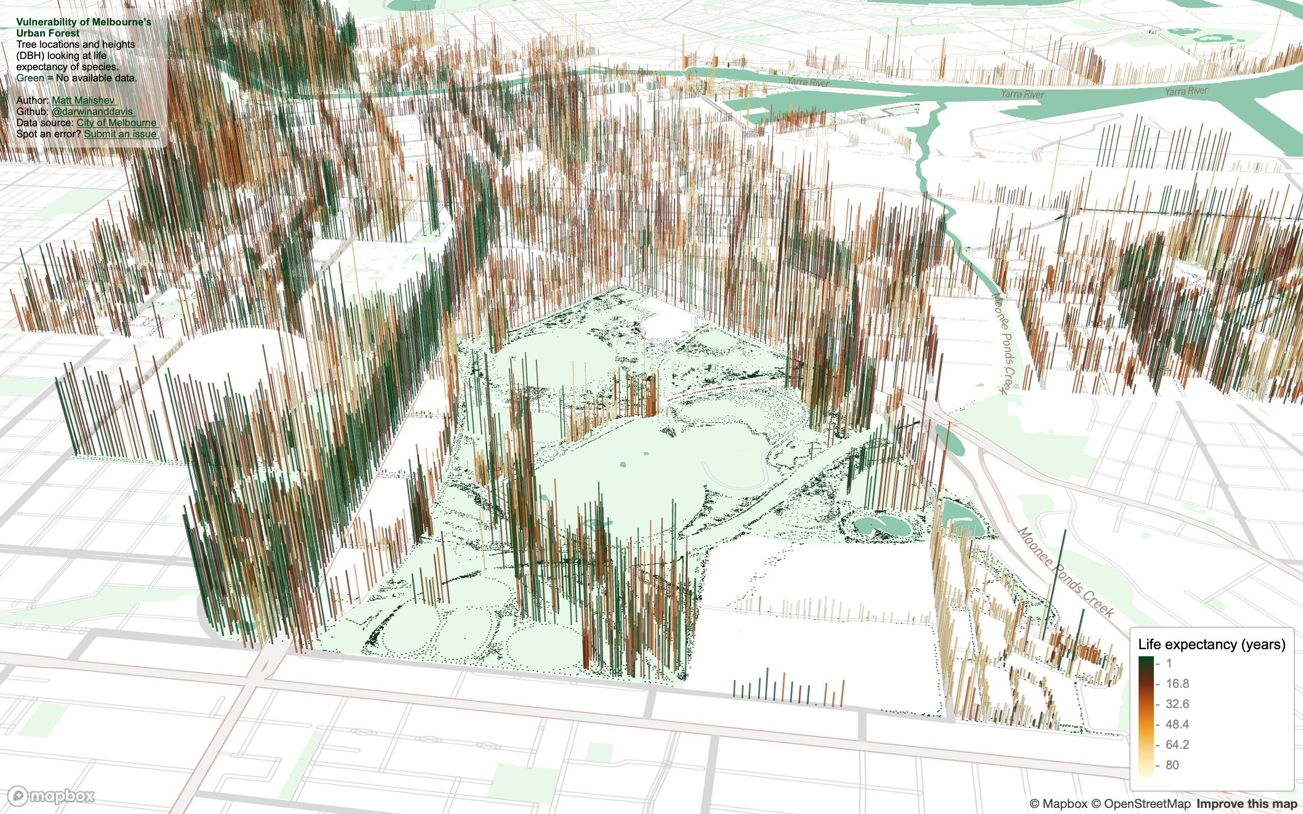
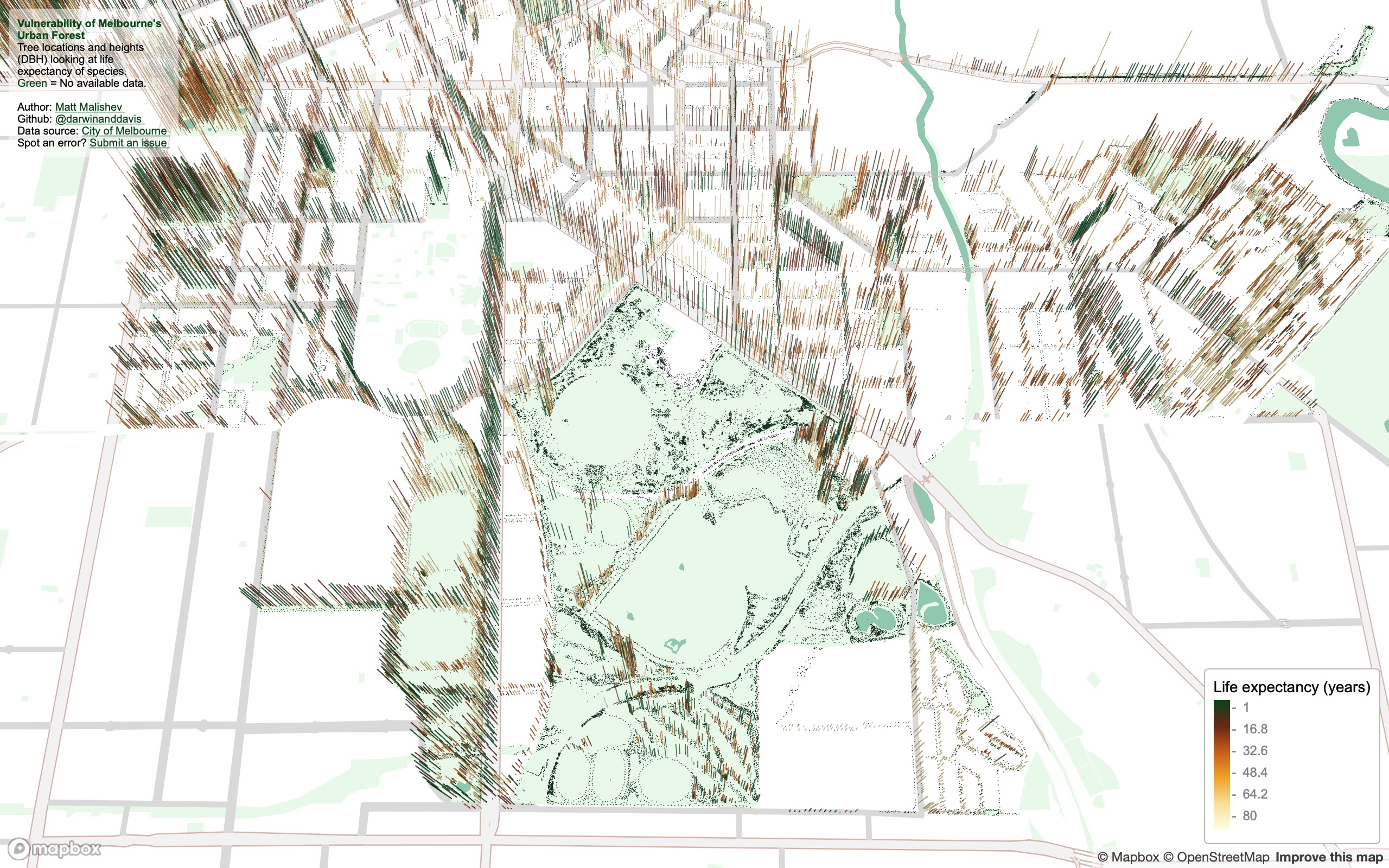
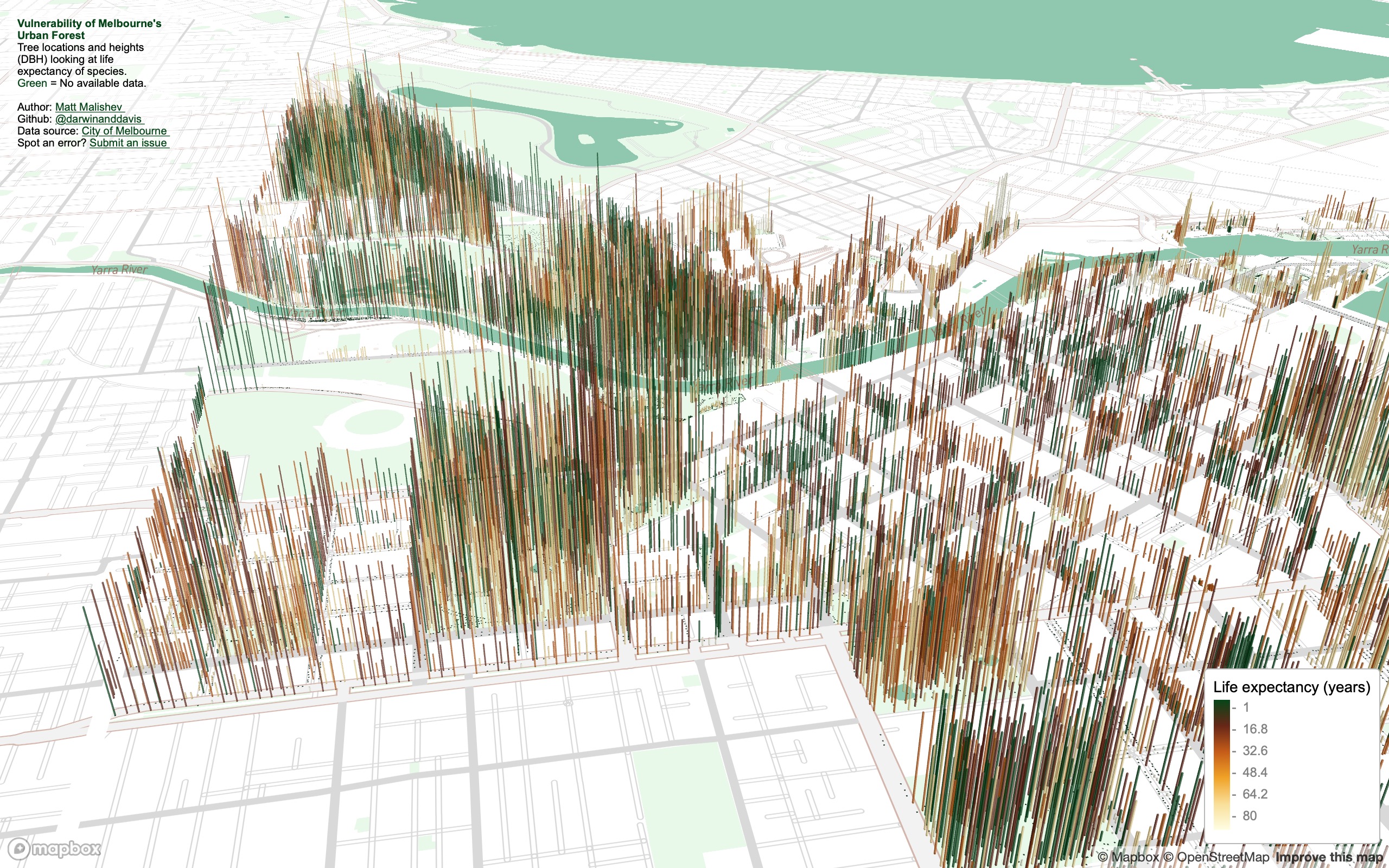
The vulnerability of Melbourne’s urban forest
I found some comprehensive data on tree canopy coverage in Melbourne from 2019 on the City of Melbourne Open Data site and tree traits are always fun to plot in 3D.
The data cover species, genera, height (DBH), life expectancy, latlons, year and date planted, precinct location, to name a few. I plotted tree locations and height to show some spatial patterns, e.g. you can see where tall trees have been cleared in areas that are known to have high rise apartments buildings. I added life expectancy as the colour factor to get a snapshot idea of planting activity by the city council and choice of species over time. Lots more to explore.
Some interesting things to explore:
- How often do invulnerable species need to be re-planted?
- What kinds of vegetation remains by 2050 if nothing new is planted?
- What species are least vulnerable to attack (disease, climate, pollution) and are these species prioritised in future urban planning?
Zoom and tilt (hold CMD/CTRL) around the map to explore hotspots for given trees based on height and age. Press the down arrow or use the up/down webpage scroll bar if the legend is chopped off.
Click for full map
(Best viewed full screen; switch browsers if loading time is slow)
Snapshot analysis
SW of city, facing NE. The Central Business District (CBD, centre grid), showing low canopy and short-lived vegetation. The central downtown probably aims for seasonal, high turnover species to match the rapid development pace of the area.
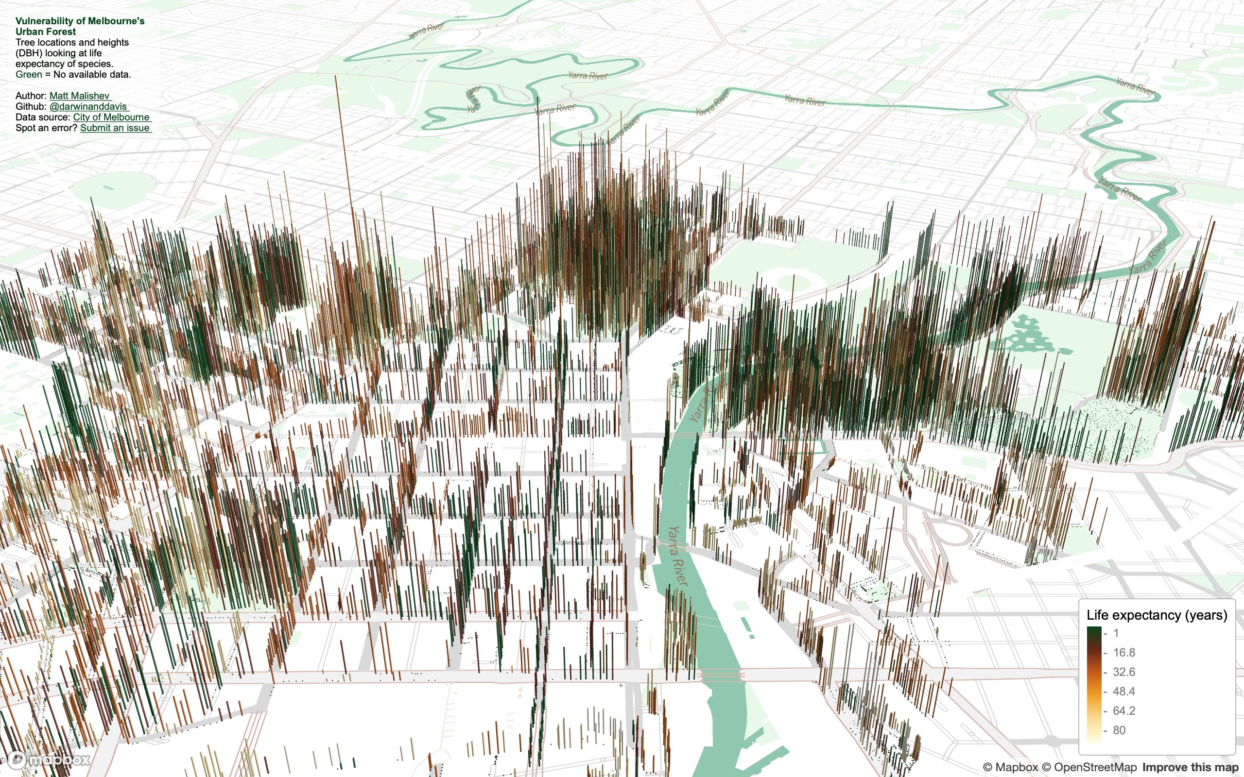
West of city, facing SE. Low canopy or young long-lived species lining the Docklands, the major port area of the city, which also has high-rise apartment buildings.
North of city, facing SSE. Royal Park remains open and free of tall species. The larger, open green space is Melbourne Zoo and the National State and Hockey Centre. The bottom right pocket dominated by low canopy or young long-lived species may be due to the type of soil or bedrock adjacent to Moonee Ponds Creek.
North of city, facing south (aerial view). Tree density and location hugs Melbourne’s city grid structure.
NE of city, facing south. The highest density of the tallest (diameter at breast height, DBH) trees in the city. The large, open green spaces to the left is Melbourne/Olympic Park, Yarra Park, and AAMI Park, which house the five major state sports ovals.
Tools
R
Mapbox
pacman::p_load(here,mapdeck,dplyr,purrr,readr,showtext,stringr,colorspace,htmltools)
Links
Data
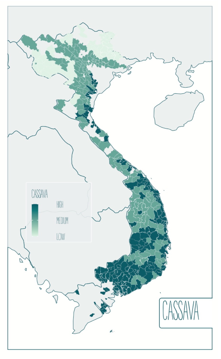
Day 14: Climate change
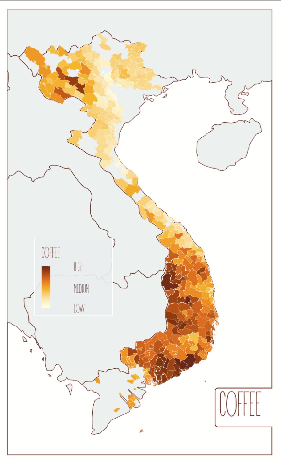
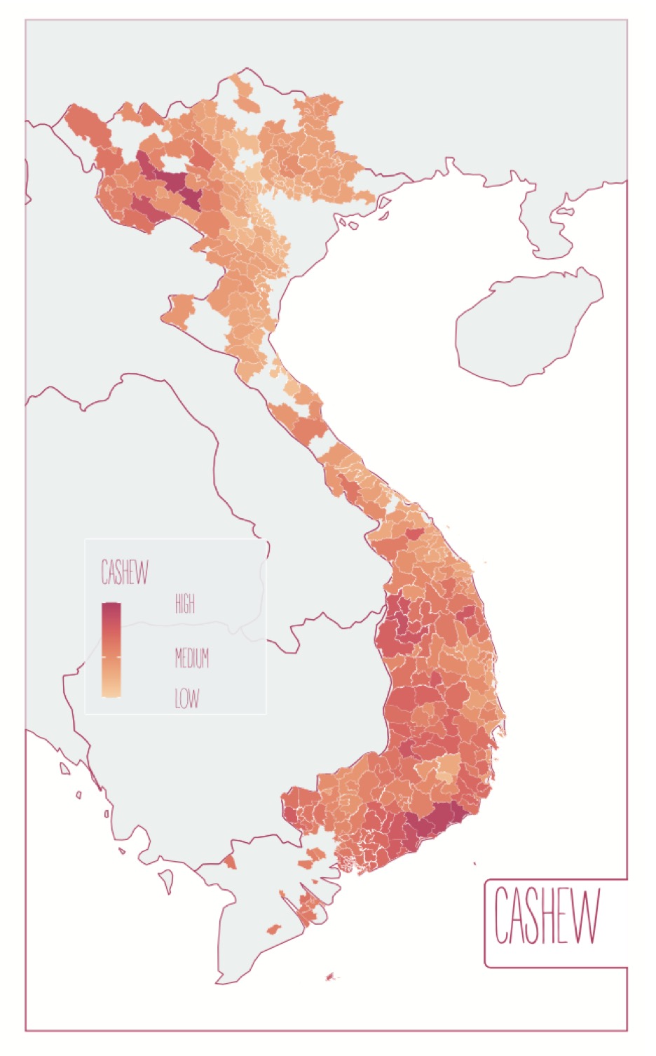
The climate risk of crops in Vietnam
Exploring exposure of coffee, cashew, and cassava crops in Vietnam to climate risk.
There are tonnes of open data on climate change impacts and I’ve worked a lot with gridded climate, microclimate, environment, and habitat data in the past. I originally planned on doing a risk map for coffee plantations in Colombia (maybe down the track), but the good stuff is paywalled by UNESCO under heritage listing and, of course, there’s a daily deadline for this mapping challenge.
I stumbled across these data from the International Center for Tropical Agriculture (CIAT) on Vietnam, including shp files, and I had to dive in. The risk indices are defined by summed values of climate change representative concentration pathway (8.5 2050), which is an international standard, county exposure to natural hazards, poverty rate (measured by the Gini coefficient), health care, infrastructure, organisational capacity, and education.
Click for full map
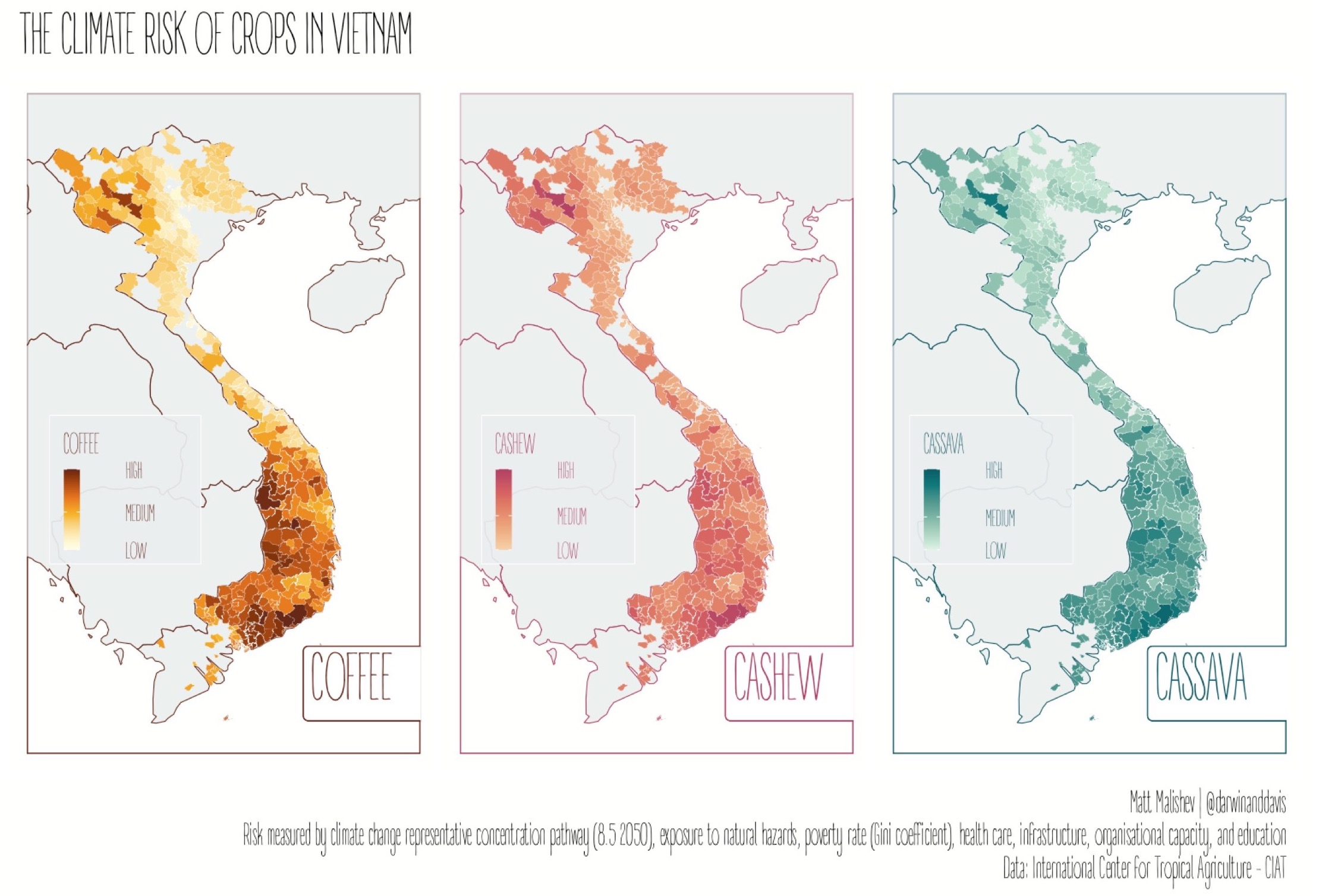
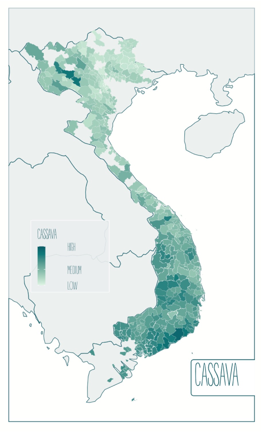
Here’s a deeper dive into the data looking at exposure of cassava crops to natural hazards.
Tools
R
pacman::p_load(ggfortify,dplyr,here,foreign,rgdal,sp,sf,mapdata,patchwork,readr,purrr,ggplot2,ggthemes,ggnetwork,elevatr,raster,colorspace,ggtext,ggsn,ggspatial,showtext)
Links
Data
CIAT - International Center for Tropical Agriculture Dataverse (CGIAR)
Parker, Louis; Bourgoin, Clement; Martinez Valle, Armando; Läderach, Peter, 2018, “VN_CRVA.zip”, Climate Risk Vulnerability Assessment to inform sub-national decision making in Vietnam, Nicaragua and Uganda, https://doi.org/10.7910/DVN/O8GOHP/QZT3YQ, Harvard Dataverse, V2
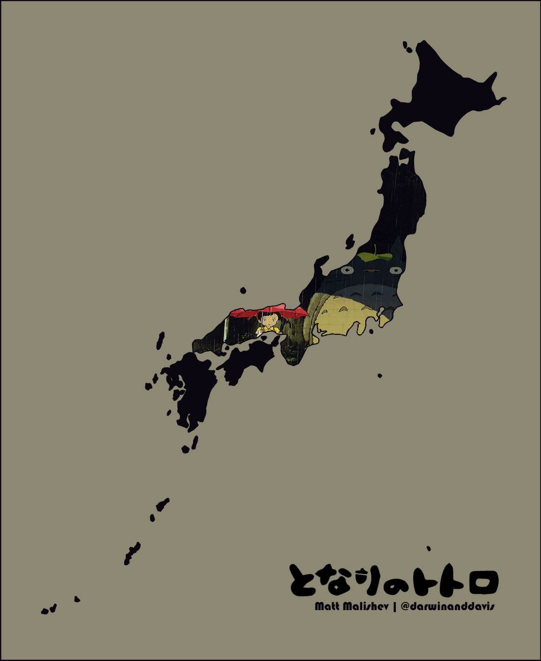
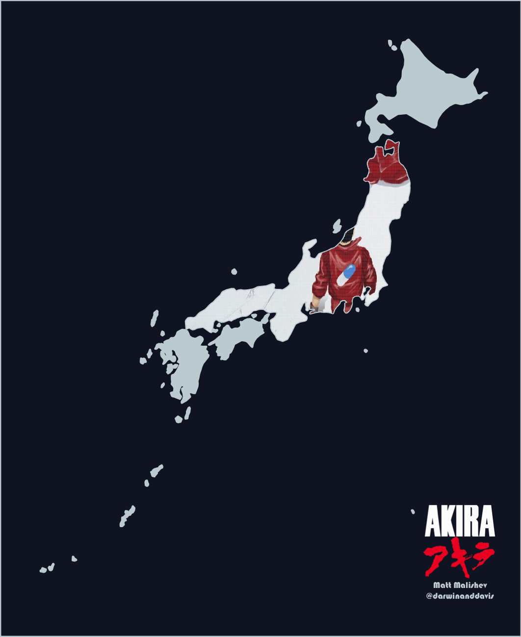
Day 16: Islands
Japan
For the Miyazaki/anime fans AKA seeing if I could bend R to my will.
My maps are usually data-driven because there are never enough data, but this was a simpler design one where I set the challenge of plotting images/arrays within geom polygons in R. An easy enough task in design and image software, but not so trivial in R. Turns out it can be done. Shout out to user @inscaven on Stackoverflow for the code base.
I also figured out how to plot images/arrays within polygons for different map projections. I may do a write up on this in the future. For now, this is a useful tool to have in my arsenal.
Click for full map
AKIRA
Click for full map
Tools
R
pacman::p_load(dplyr,readr,tidyr,rnaturalearth,rnaturalearthdata,sf,raster,png,plyr,cowplot,mapdata,sp,ggplot2,ggtext)
Links
Day 20: Population
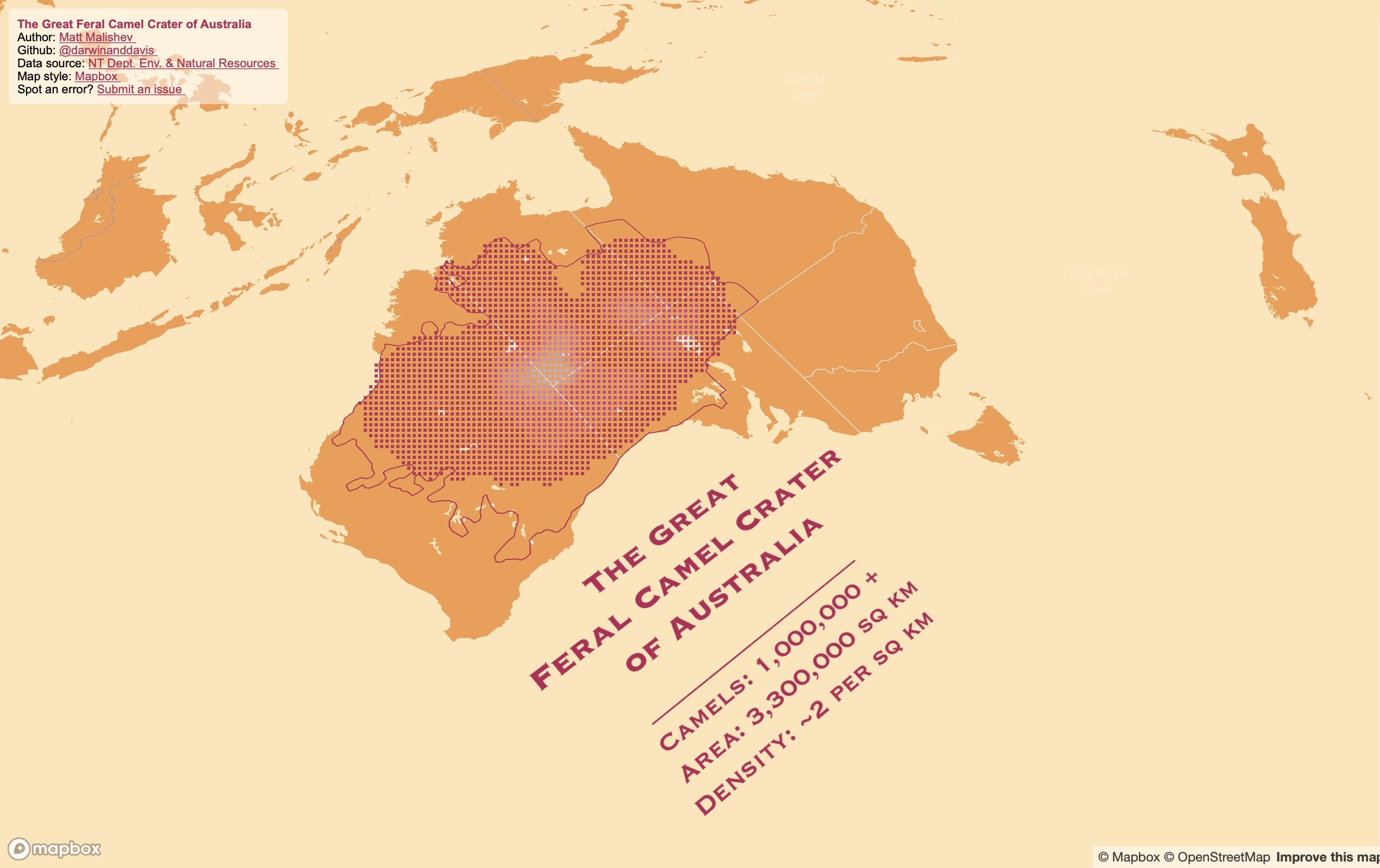
The Great Feral Camel Crater of Australia*
* not an actual landmark
Did you know Australia has camels? Millions of feral ones, roaming the deserts like big, roaming, feral camels. There are so many camels, the data almost blew up my laptop trying to map them. Here are some fun facts about Australia’s feral camels:
- Largest global population of feral, dromedary (one-humped) camels
- 3.3 million km2 total dispersal range (about 40% of rural Australia)
- About 0.5–2 camels / km2
- First introduced in 1840, so that’s a long time for camels to settle
- Compounded annual growth at an enviable 8% pa over the last 70 years
Here’s the picture summary.
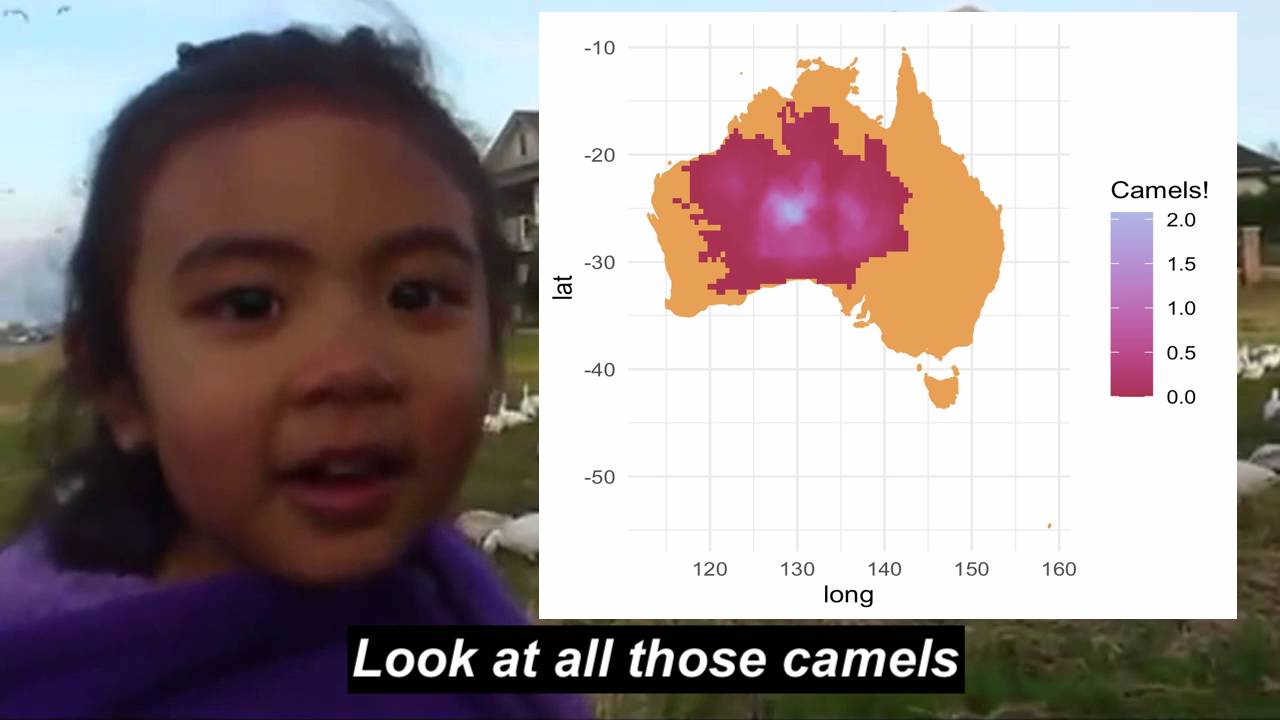
I found these data online from Northern Territory’s Department of the Environment and Natural Resources and the original research paper from Saalfeld & Edwards (2010).
These data are from aerial observations and the boundary line is expected dispersal (old data, so they’re probably in your backyard by now). Low density (magenta) represents approx. 0.25 camels, high density (white) represents ~2 camels. Lots of camels.
Click for full map
Tools
R
Mapbox
pacman::p_load(dplyr,here,mapdeck,rgdal,sp,sf,raster,colorspace,mapdata,ggmap,jpeg)
Links
Data
Department of the Environment and Natural Resources – Northern Territory of Australia.
Saalfeld W. K., Edwards G. P. (2010) Distribution and abundance of the feral camel (Camelus dromedarius) in Australia. The Rangeland Journal 32, 1-9, https://doi.org/10.1071/RJ09058
Day 23: Boundaries
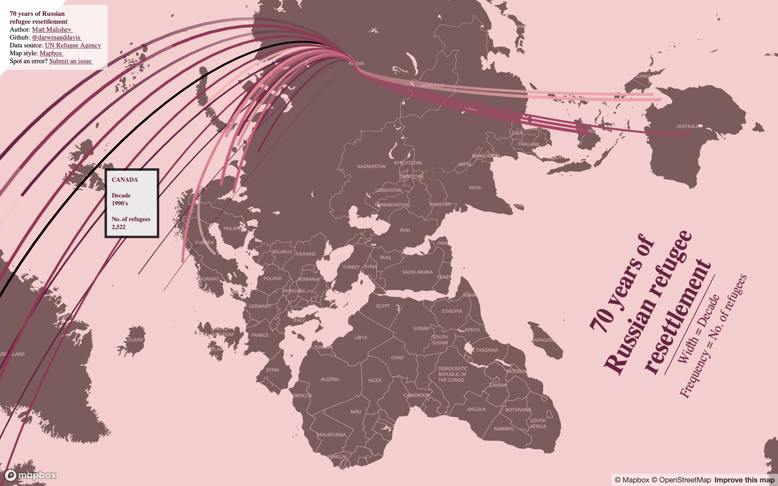
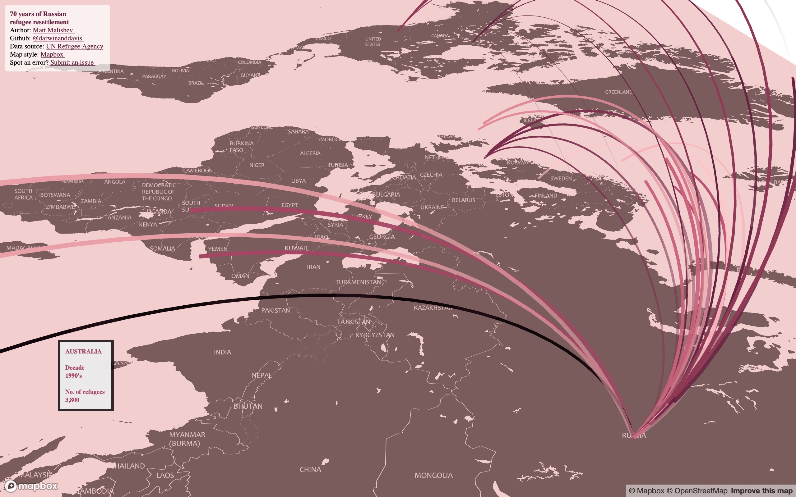
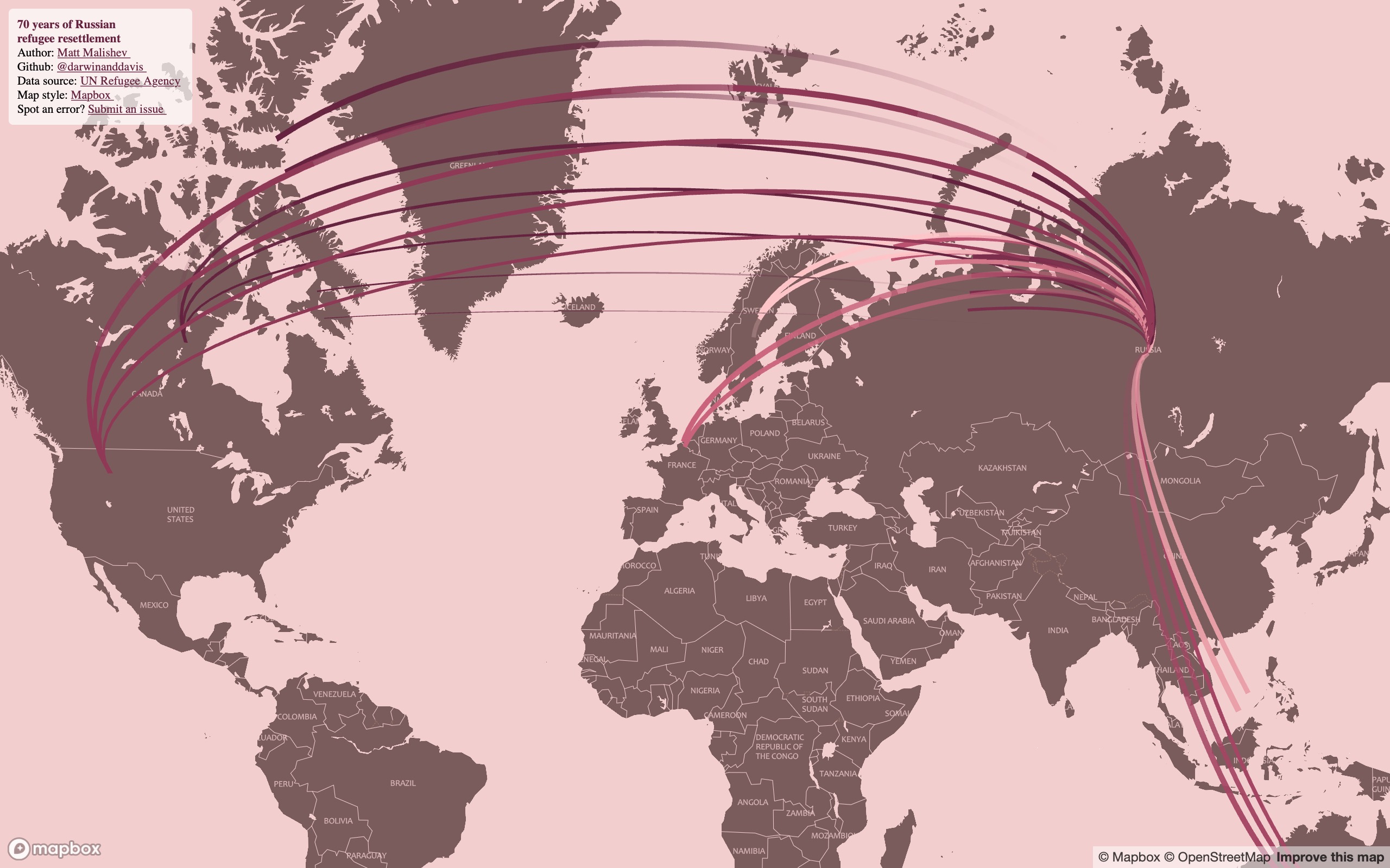
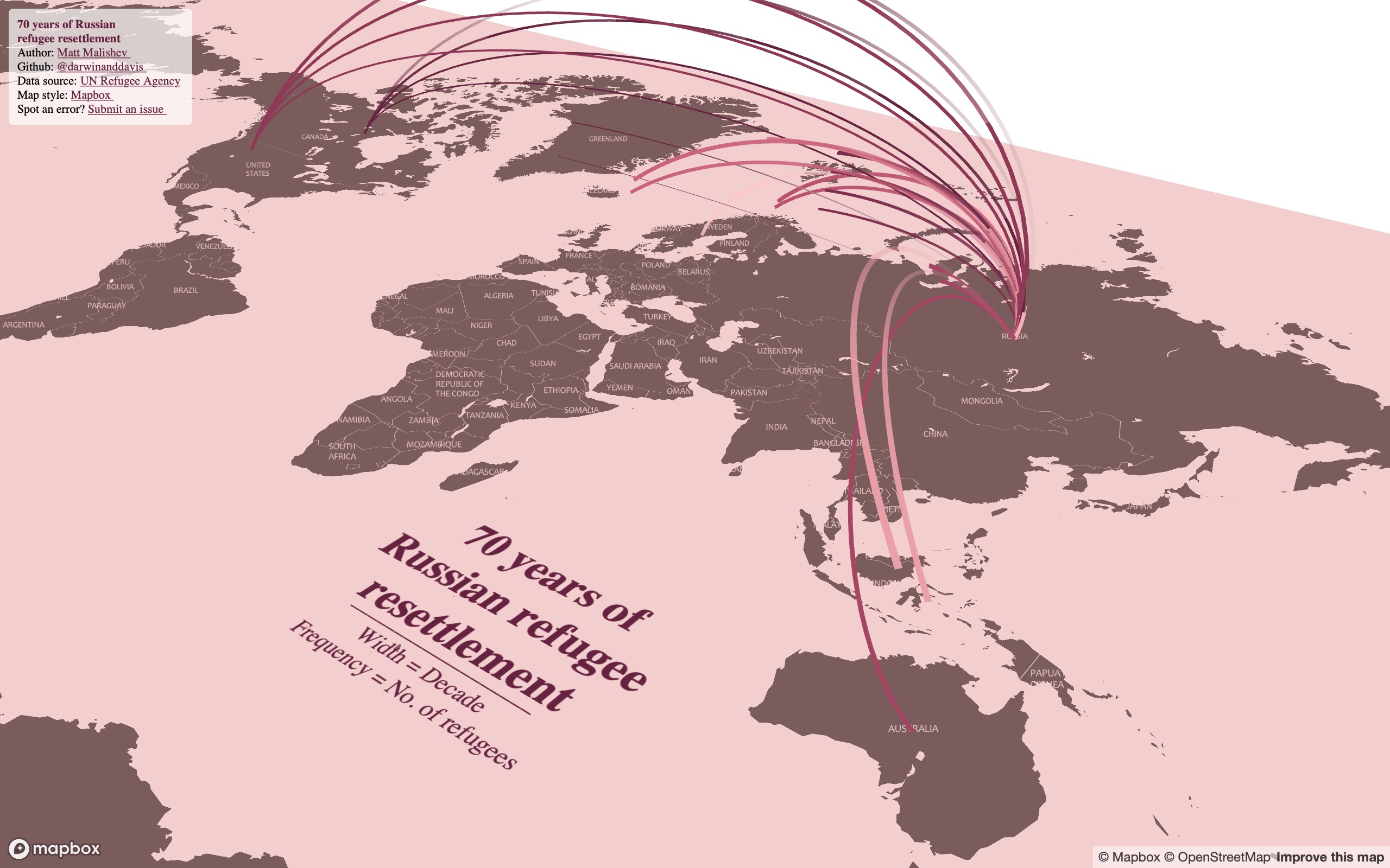
70 years of Russian refugee resettlement
More of a take on no boundaries through the lense of no boundaries between country borders for refugees, economically-displaced peoples, migrants, and new horizon seekers.
I found these human migration data online from the UN Refugee Agency and being close to my own Russian heritage, I wanted to see what patterns in Russian refugee and emigration numbers emerged over the decades. The data span 1950 to 2017. The original dataset is broken up into individual years, but it looked super messy when I first mapped it, so I instead collapsed the data into decades to create a neater design.
Notes
- Width of lines = decade of migration scaled relatively from 1950s to 2010s
- Frequency of line movement = proxy for the quantity (number of refugees)
- Hover over the lines to view the refugee migration numbers for that country
- Zoom and tilt (hold CMD/CTRL) around the map to explore
Click for full interactive map
(Best viewed full screen; switch browsers if loading time is slow)
Tools
R
Mapbox
pacman::p_load(here,dplyr,rworldmap,mapdeck,sf,sfheaders,data.table,readr,rgeos,purrr,stringr,ggthemes,showtext,geosphere,htmlwidgets)
Links
Data
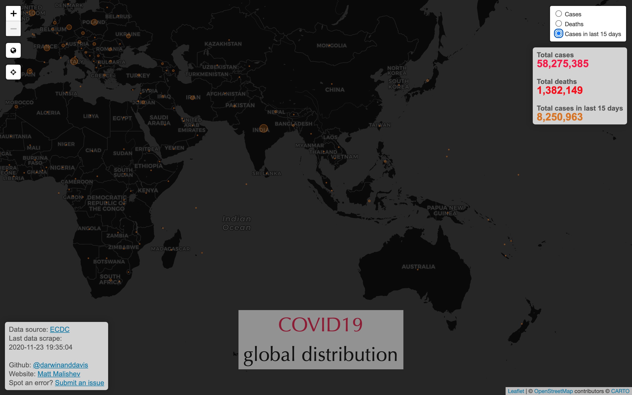
Day 25: COVID19
Realtime interactive map of COVID19 coronavirus global distribution
Create an interactive map of COVID19 coronavirus global distribution using live webscraped data from the European Centre for Disease Prevention and Control (ECDC).
Click for interactive map
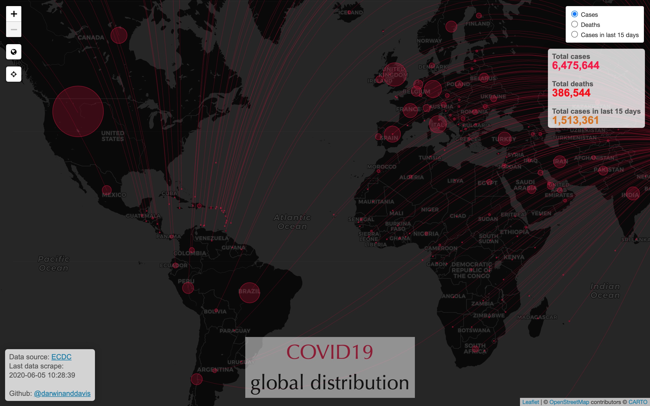
Global cases (plus cases ranked)
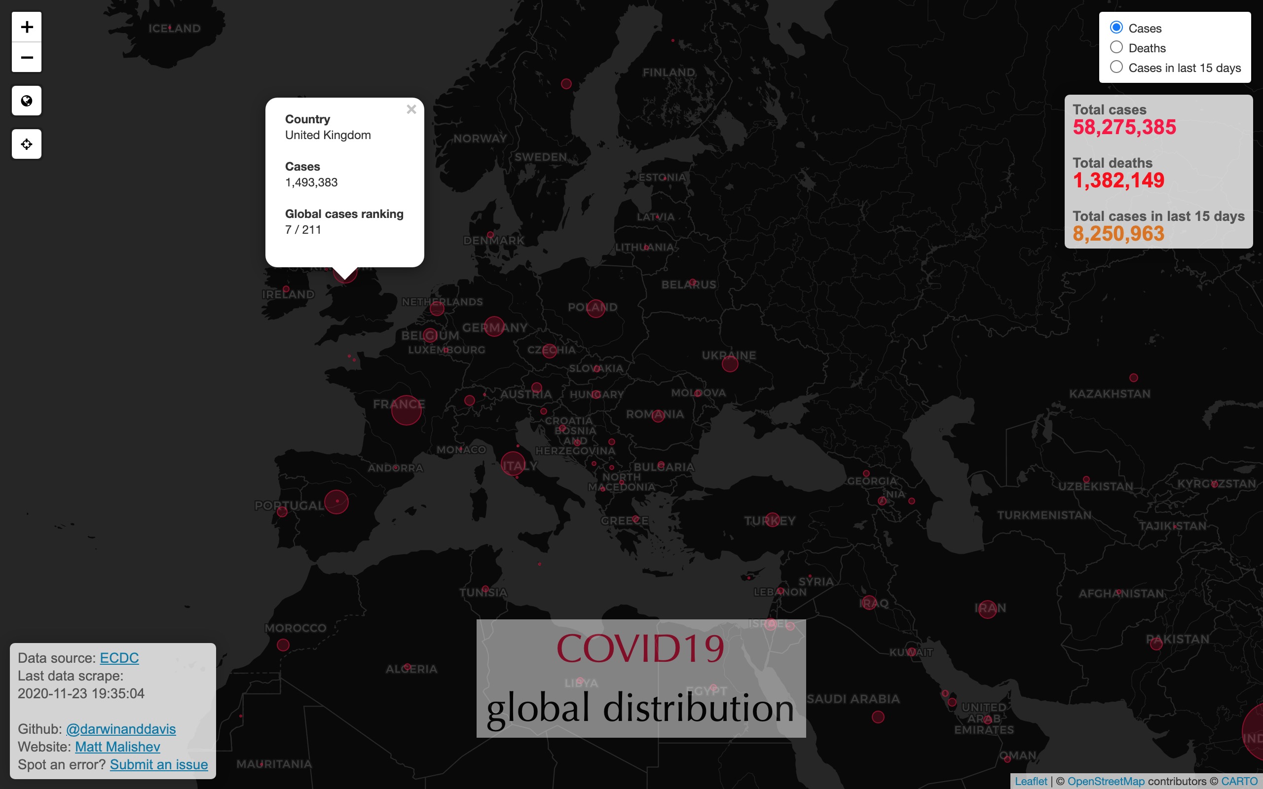
Global deaths (plus deaths ranked)
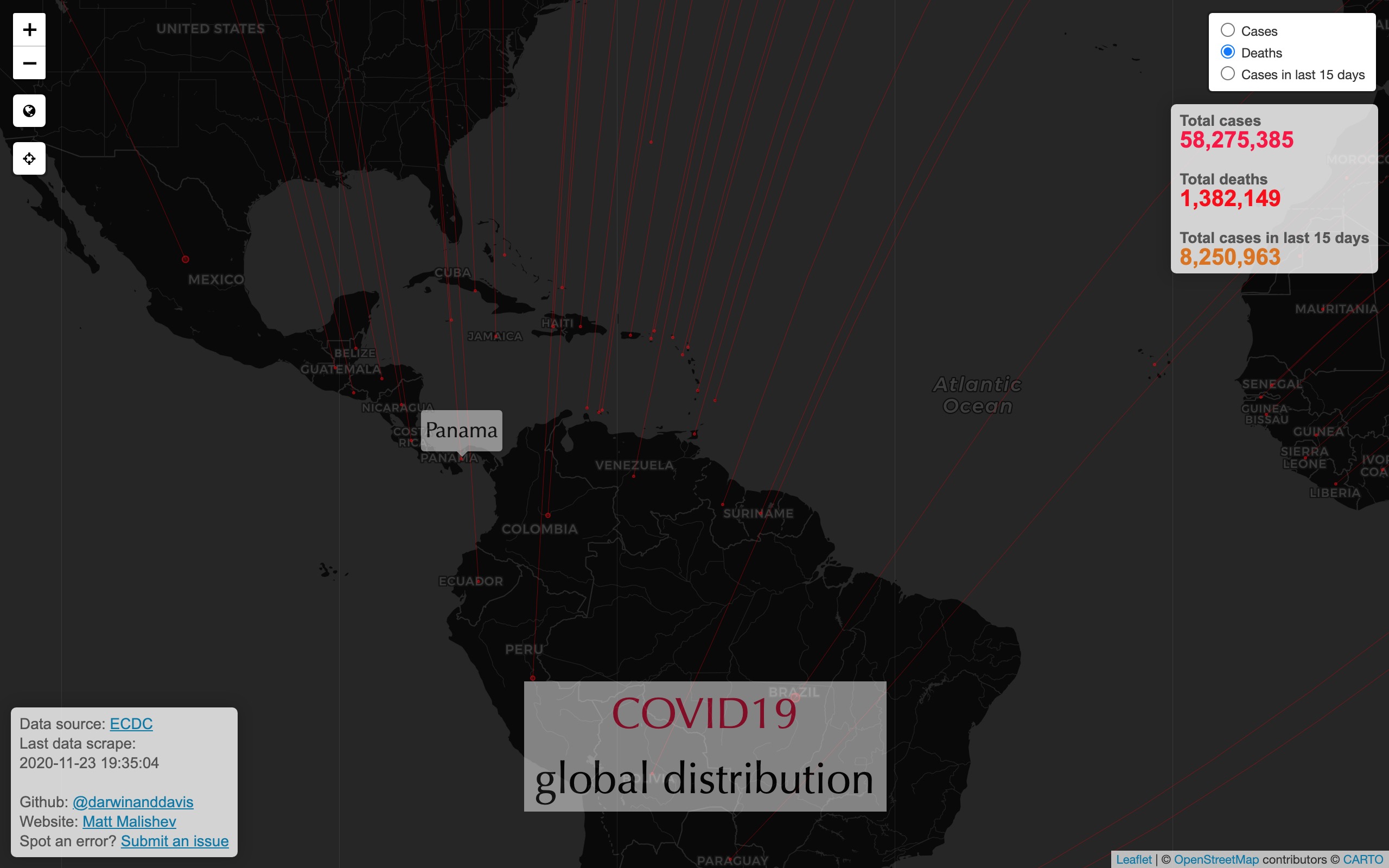
Global cases in last 15 days
Tools
R
Leaflet
HTML
CSS
pacman::p_load(maps,dplyr,leaflet,xml2,rvest,ggmap,geosphere,htmltools,mapview,purrr,rworldmap,rgeos,stringr,here,htmlwidgets,readxl,httr,readr,stringi)
Links
Data
European Centre for Disease Prevention and Control (ECDC).
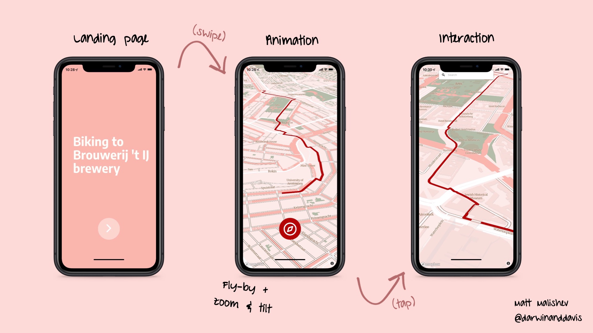
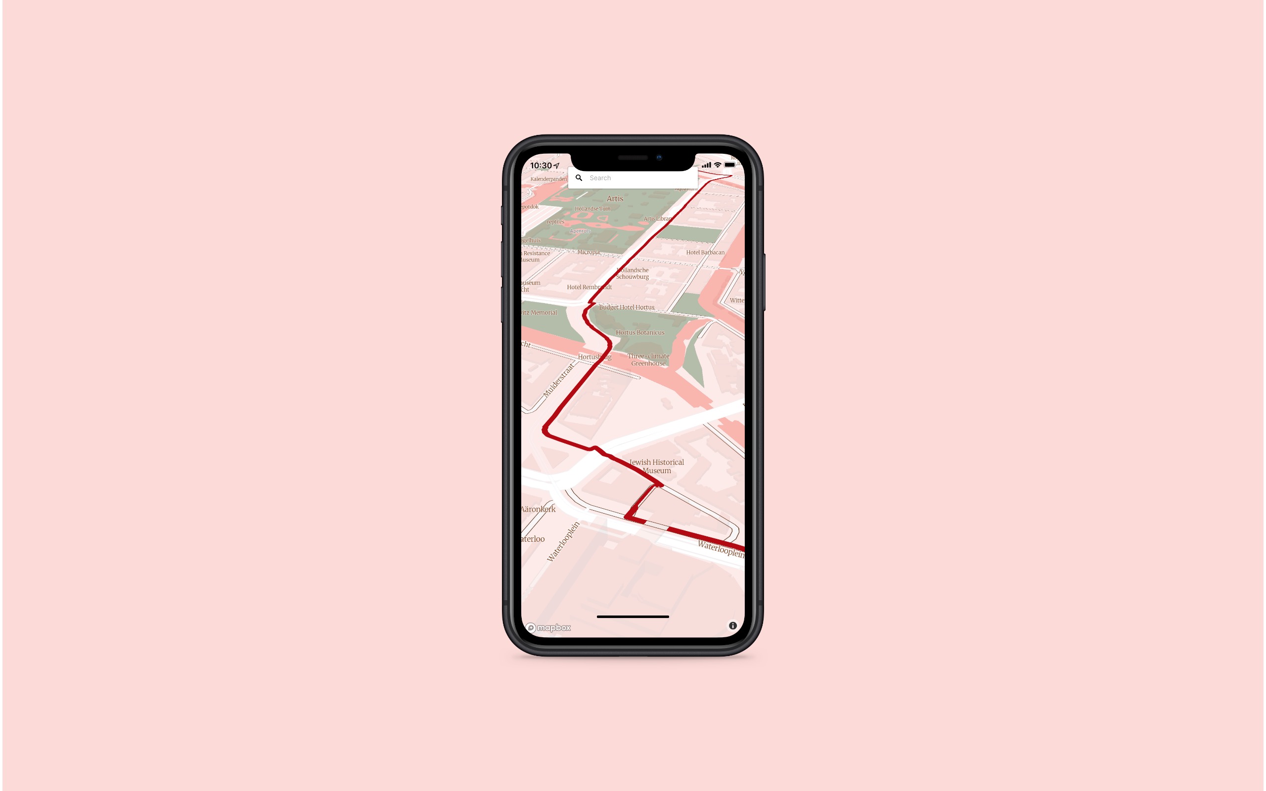
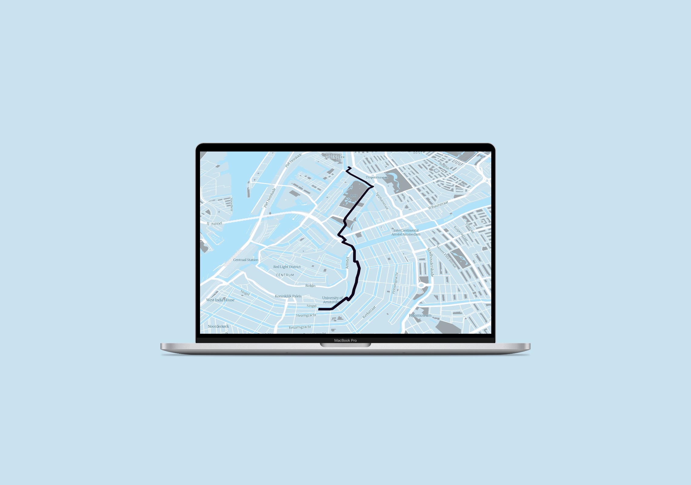
Day 26: Mapping with a new tool
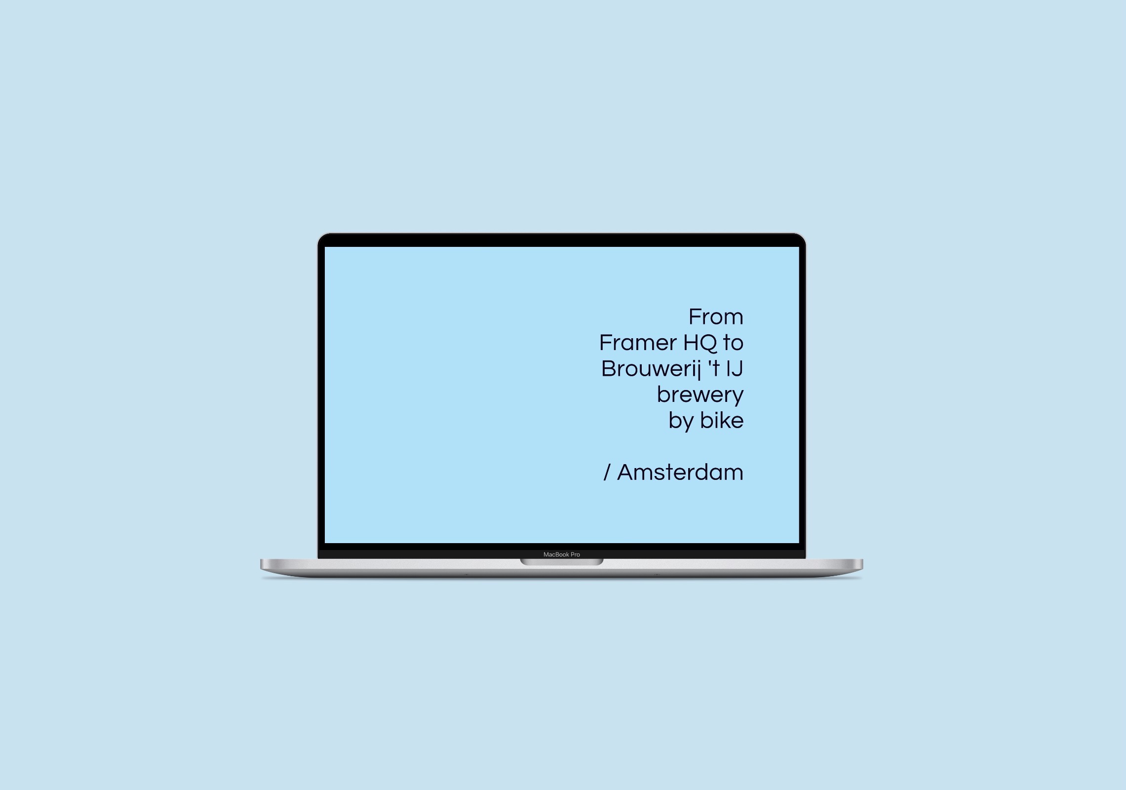
Using Framer and Mapbox to design a mobile interface
I’ve been meaning to dive into Framer ever since I watched a webinar a few months ago. It’s really fun and intuitive. You can integrate Mapbox’s features and preload data using imported tilesets, then prototype the interface in Framer.
As a toy project, here are biking directions from Framer HQ (I think) in Amsterdam to my favourite brewery, Brouwerij ‘t IJ, modelled on an iPhone 11.
Click for interactive mobile prototype

If you’re unfamiliar with Framer, it’s a prototyping tool. Tons of features, interactions, device platforms, graphics, and icon sets.
Here’s the process for this project.
- Import the geolocation KML data and create a tileset in Mapbox Studio
- Design the map in Mapbox Studio
- In Framer, link the Mapbox API and apply features from the Mapbox components package, such as
SequentialLocationMap - Design the interface, including layout, buttons, transitions, icons, and colour palettes, in Framer using any device/media interface as a template
- Share the project with collaborators
One cool aspect is you can open the prototype on your own mobile and use regular gestures to navigate the interface.


From here, it’s pretty simple to switch to different device skins, as well as integrate a newly created design and palette from Mapbox Studio.
Tools
Framer
Mapbox
Links
Day 30: A map
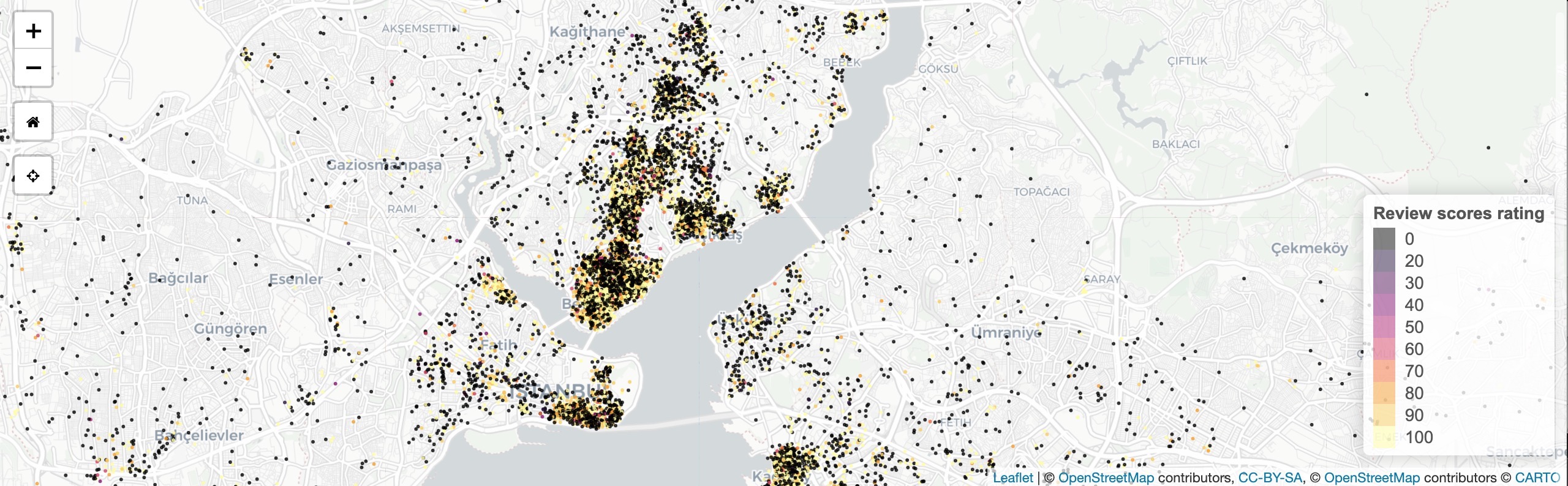
Mapping and analysing Airbnb’s global property listings
An R Shiny app exploring spatial patterns in Airbnb listings to compare property listing criteria around the world. Part of a larger project I recently finished. The aim was to create a web app that mimics that Airbnb site, but uses data analysis to map available listings to comapre cities around the world based on user criteria rather than simply listing price and availability.
Check out the project page for the full writeup.
Launch Shiny app

Example outputs
Sydney, Australia. Security deposit, 2 bedrooms, $100–$1000 p/n

Istanbul, Turkey
Tools
R
Shiny
Leaflet
HTML
CSS
pacman::p_load(shiny,shinythemes,dplyr,here,leaflet,rgdal,sp,sf,raster,colorspace,mapdata,ggmap,jpeg)
Links
Data
Inside Airbnb open data
| Back to top | Home page |